Seattle Police Department.2024
Seattle Crime Insights Dashboards
Turning raw crime and arrest data into actionable insights for safer, smarter cities.The Seattle Crime Dashboard transforms open data from the Seattle Police Department (SPD) into an interactive platform for exploring trends and validating hypotheses.
I cleaned and enriched raw data, layered in community insights, and designed a dashboard that turns complex crime trends into clear, actionable visuals.
Deliverable
- Insights Report
- Dashboard Workbooks
- Tableau Prep File
- Cleaned Datasets
- Original Datasets CSVs
- Dashboard Workbooks
- Tableau Prep File
- Cleaned Datasets
- Original Datasets CSVs
Team
3 members
Duration
12 weeks
tool
- Tableau Prep
- Tableau
- Tableau
Excellent analysis and justification of data cleansing techniques. Well reasoned and well executed analysis, and bonus for extending the new dataset even further than plain old Seattle 911.
Dashboard loading… please wait.
Objective
Create an interactive dashboard and report that transform raw SPD data into clear, actionable insights — enabling users to explore patterns, validate hypotheses, and make data-informed decisions.
Data Sources
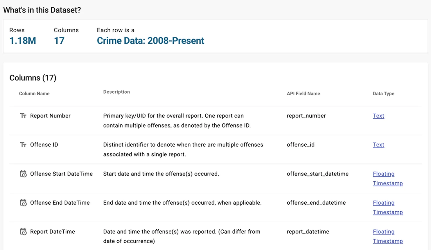
1. SPD - Crime Data (2008-Present)
Daily crime reports with incident details and generalized locations, standardized by RMS and NIBRS.
Daily crime reports with incident details and generalized locations, standardized by RMS and NIBRS.
2. SPD - Arrest Data
Arrest records with incident types, demographics, and timestamps, updated regularly for accuracy.
Arrest records with incident types, demographics, and timestamps, updated regularly for accuracy.

3. SPD Micro Community Policing Plans (Web Mercator)
Neighborhood-level data reflecting community concerns and police response needs, maintained by Seattle University.
Neighborhood-level data reflecting community concerns and police response needs, maintained by Seattle University.

Crime Data Preparation
Data Cleaning
The SPD Crime dataset was cleaned for analysis with these steps:

- Date Range
Filtered to January 1, 2017–December 31, 2022. - Data Reduction
Removed 'Report Number', 'Offense End DateTime', and redundant fields like 'Group A/B' and 'Corresponding Offense'. - Renaming
Updated field names for clarity (e.g., 'Offense ID' to 'Report Number', 'MCPP' to 'Neighbourhood'). - Data Joining
Added MCPP shapefile for map visualizations. - De-duplication
Removed duplicate fields like 'Precinct'. - Null/Unknown Removal
Cleared undefined locations (<5% of data) and excluded 'Not a Crime' entries.
Challenge
Challenge 1: Unknown and Null Data
Problem
Null/unknown entries in latitude/longitude fields caused misleading map outliers at (0,0).
Null/unknown entries in latitude/longitude fields caused misleading map outliers at (0,0).
Solution
After analysis, these entries (<5% of data) were removed, improving map clarity and accuracy without compromising dataset integrity.
After analysis, these entries (<5% of data) were removed, improving map clarity and accuracy without compromising dataset integrity.

Challenge 2: MCPP Map Border Creation
Problem
Creating MCPP boundaries using polygonID/pointID methods was complex and required GIS expertise.
Creating MCPP boundaries using polygonID/pointID methods was complex and required GIS expertise.
Solution
Pre-existing MCPP and beat shapefiles from ArcGIS were downloaded and joined with the crime dataset, simplifying the process.
Pre-existing MCPP and beat shapefiles from ArcGIS were downloaded and joined with the crime dataset, simplifying the process.

Arrest Data Preparation
Data Cleaning
The SPD Arrest dataset was cleaned to align with the primary crime dataset:

- Date Range
Filtered to January 1, 2017–December 31, 2022. - Data Reduction
Removed irrelevant fields (e.g., officer details, 'Terry Stop Involved') and retained 'NIBRS Description' for compatibility. - Reclassification
Consolidated 54 NIBRS types into 33 groups (e.g., 'Person', 'Property') for streamlined analysis. - Null Handling
Reclassified 'Unknown' entries (e.g., 'Gender Diverse' for gender, 'Other' for race) and removed ambiguous entries (e.g., '-', 'FK ERROR'). - Null/Unknown Removal
Cleared undefined locations (<5% of data) and excluded 'Not a Crime' entries.
Challenge
Data Standardization and Classification
Problem
Regrouping 54 offense types in the SPD Arrest Data was time-consuming and error-prone due to complex classifications.
Regrouping 54 offense types in the SPD Arrest Data was time-consuming and error-prone due to complex classifications.
Solution
Each offense type was meticulously cross-referenced with the primary crime dataset and regrouped into broader categories ('Person', 'Society', 'Property', 'Other', 'Not Reported to NIBRS') for accuracy.
Each offense type was meticulously cross-referenced with the primary crime dataset and regrouped into broader categories ('Person', 'Society', 'Property', 'Other', 'Not Reported to NIBRS') for accuracy.

Data Cleaning Outcomes
The data cleaning process significantly improved SPD dataset quality:
Noise Reduction
- Removed outliers and incorrect geographic data, reducing geospatial analysis errors.
Simplified Analysis
- Consolidated NIBRS descriptions and aligned sector codes for consistency.
Enhanced Completeness
- Addressed missing/ambiguous entries, improving reliability for trend analysis.
The cleaned dataset enables more accurate crime pattern mapping, arrest profiling, and resource allocation, supporting data-driven public safety decisions.
Analysis
Overview: Crime Landscape
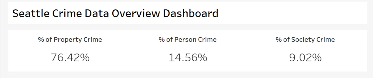
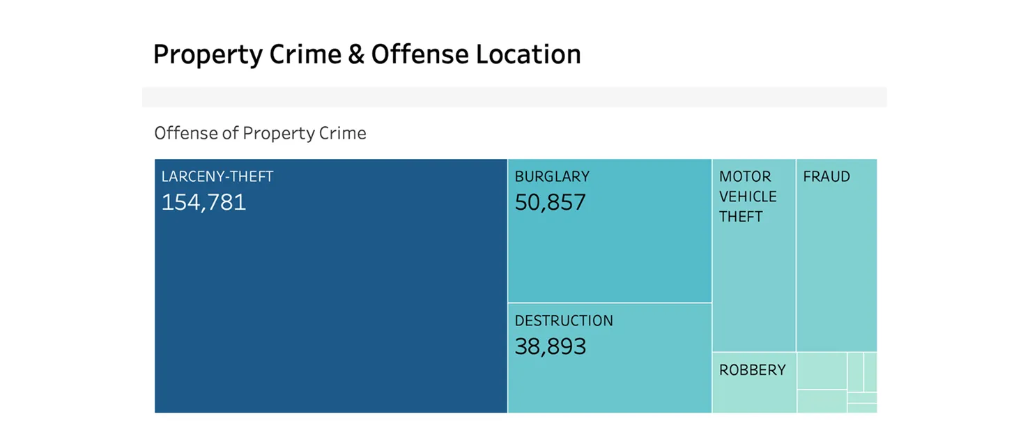
The dashboard reveals that 76.42% of total crime incidents are property-related, making it a key focus for city planners and law enforcement.
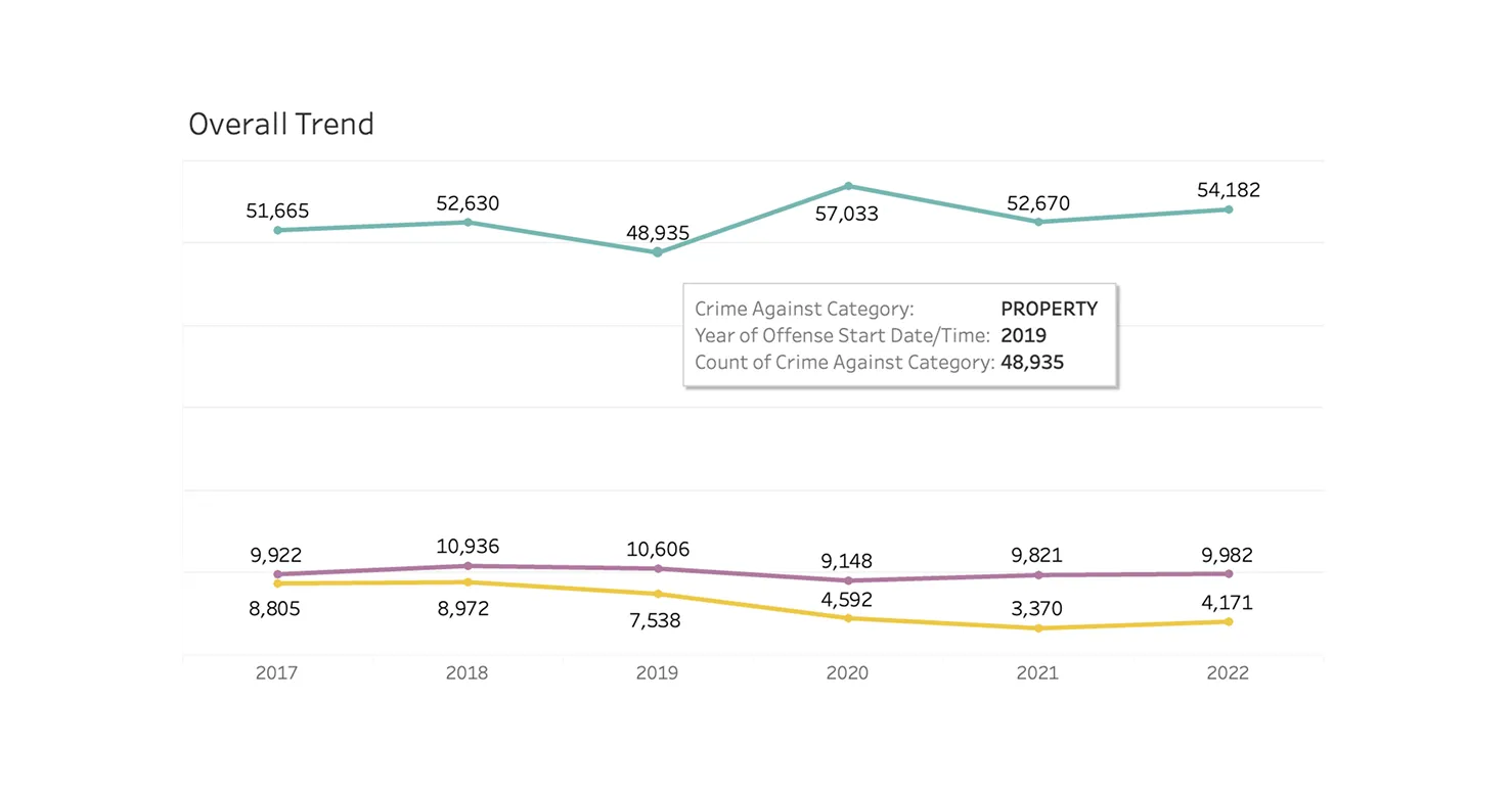
The overall trend from 2017 to 2022 shows recurring seasonal patterns that can inform proactive community safety strategies.
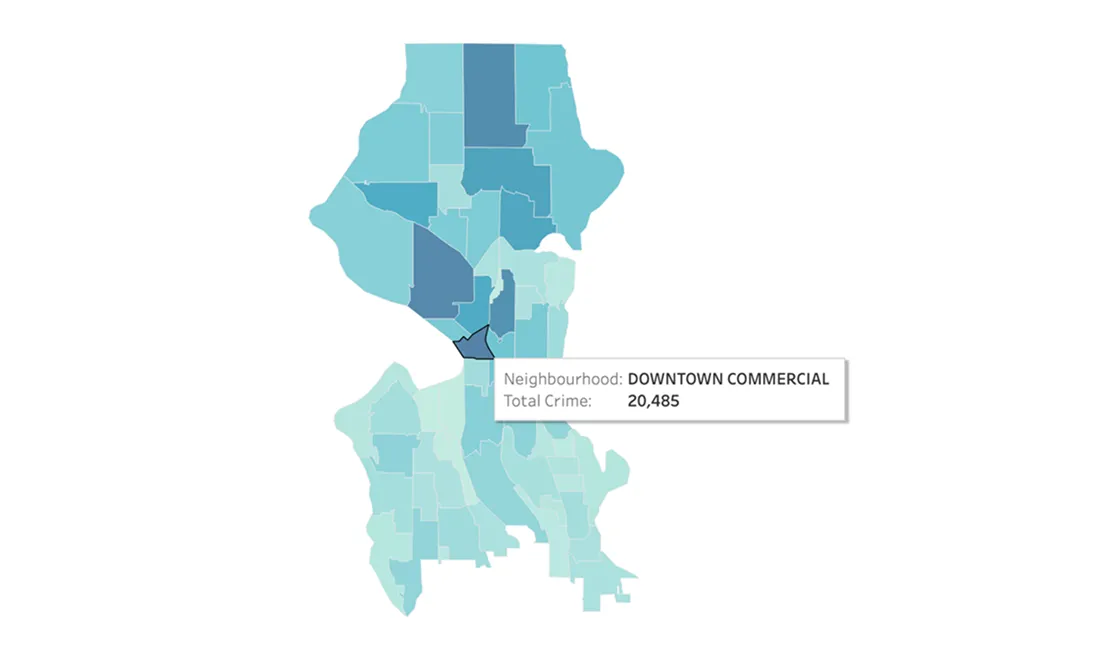
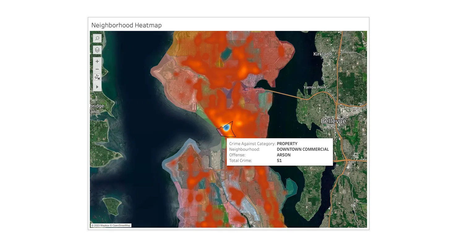
Geographic Focus: Downtown Commercial
Neighborhood analysis highlights Downtown Commercial as the highest crime area, with 20,485 property crimes, supported by heatmap visualizations tied to Seattle’s Micro Community Policing Plans (MCPPs).
Insight 1: Assumptions About Property Crime Type
HYPOTHESIS 1: Burglary would be the most common property crime.
Reality: Data shows larceny-theft is most prevalent, proving the value of data-driven decisions over assumptions.
Hotspot Identified: The Downtown Commercial area reports 20,485 property crimes.
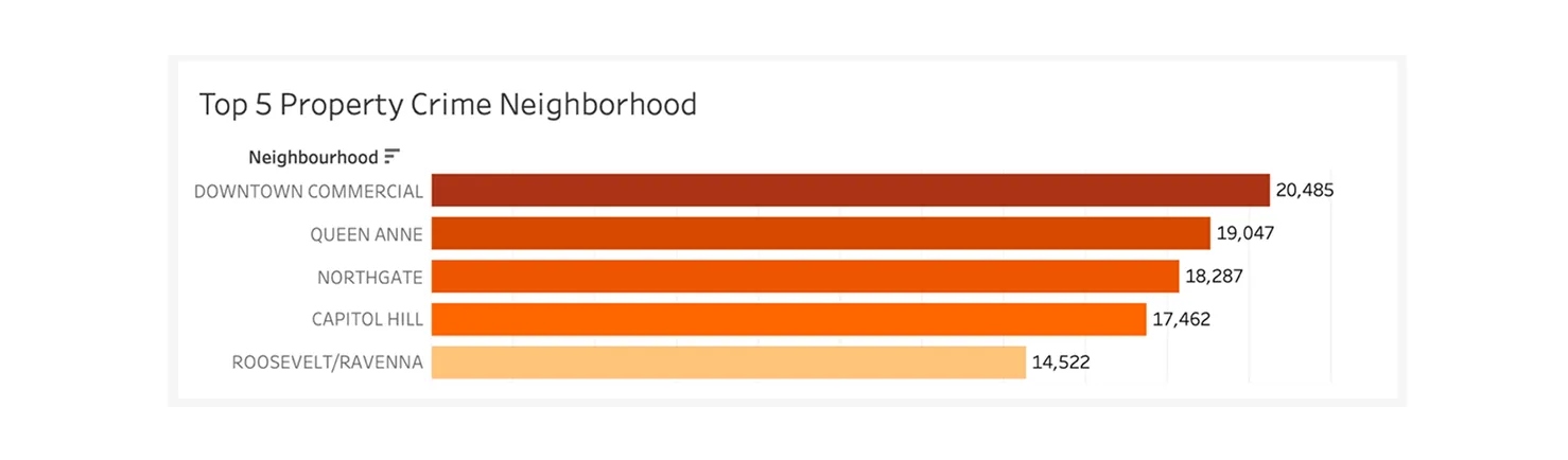
The highest across neighborhoods — confirmed by the heatmap, which centers on this district.
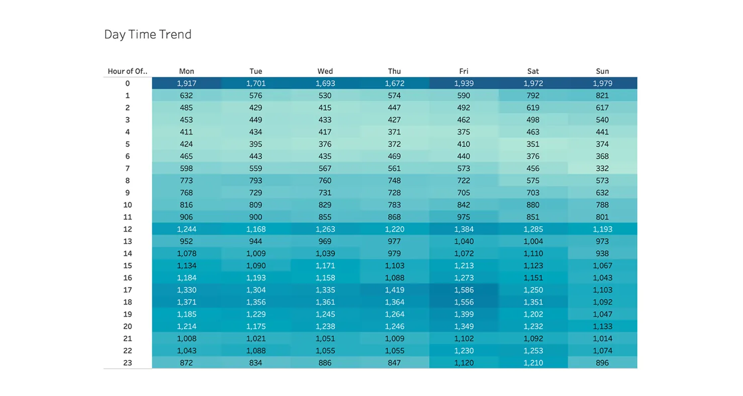
Insight 2: When Does Crime Peak?
HYPOTHESIS 2: The occurrence of larceny theft is significantly higher from 4pm-12am.
Reality: Confirmed.
Quarterly & monthly trends show crime spikes in Q4, especially in October.
Quarterly & monthly trends show crime spikes in Q4, especially in October.
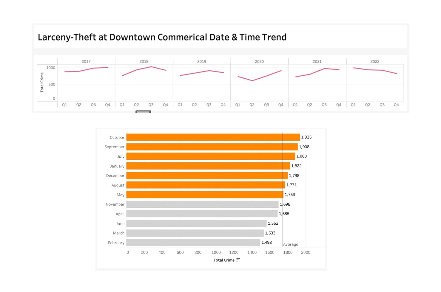
The Day & Time heatmap reveals peak incidents at 12:00 am on From Friday to Sunday, with clear risk windows from 4pm–12am.
Insight 3: Who’s Being Arrested?
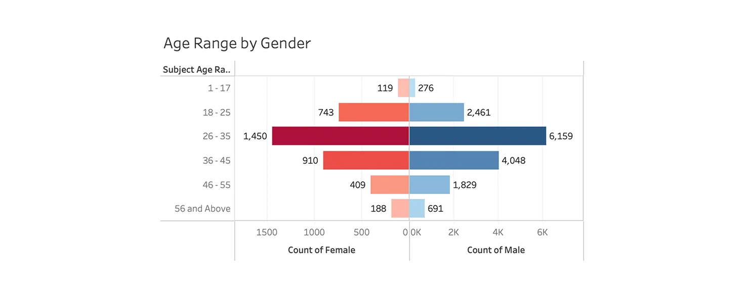
Hypothesis: Property crime is most prevalent among men aged 36–45.
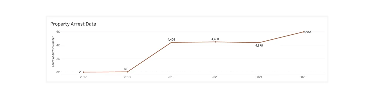
Reality: Arrests rose sharply from 20 in 2017 to 5,954 in 2022, reflecting an overall surge in property crime enforcement.
The age range with the most arrests is 26–35, not 36–45, with men leading at 6,159 incidents.
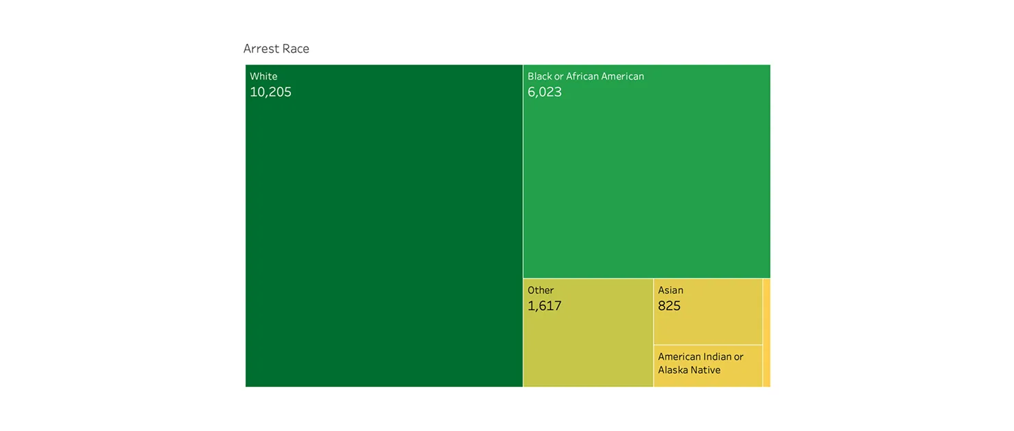
Demographic Breakdown: A race-based treemap reveals that White individuals account for the highest number of arrests (10,205) for property crimes between 2017 and 2022.
Insights into Action
Target High-Risk Age Groups
- Launch outreach programs for the 26–35 age group in hotspots like Downtown — focusing on theft prevention, job support, or recovery services.
Adjust Patrol Hours
- Increase patrols between 4pm–12am, when larceny-theft peaks, to improve visibility and deterrence during high-risk times.
Strengthen Community Partnerships
- Collaborate with local businesses and residents to enhance safety through better lighting, surveillance, and neighborhood watch efforts.
Review Arrest Trends for Fairness
- Regularly audit arrest data to check for bias and ensure enforcement is equitable and community-focused.
Promote Transparency Through Dashboards
- Keep the public informed with accessible crime dashboards — empowering communities to stay aware and take action.
Key Takeaways
1. Clean, Complete Data Is Everything
I learned that missing or inconsistent data can seriously limit analysis. Defining what to collect and how to categorize it at the start is essential to meaningful insights.
2. Data Cleaning Requires Purpose, Not Just Process
Cleaning isn’t just about fixing errors; it’s about focusing on the right data. Clarifying the goal, objective, and target audience early on helped me prioritize what mattered most.
3. Data Is Multi-Dimensional
I explored crime data through different perspectives such as time, location, type, and volume, which allowed me to find deeper patterns and trends.
4. Visualization = Storytelling
I began to see that good data visualization isn’t just about making things look nice; it’s about telling a clear story and guiding the viewer through the insights.
5. There's Room to Enhance Interactivity
Given more time, I’d strengthen the relationships between charts to build a more connected experience. I’d also experiment with filters, toggles, and sliders to let users explore multiple layers of the data without overwhelming them.
