.png)
Coherent - Spark.2022
A Scalable UX for API Platform
Spark, a product by startup Coherent, turns Excel spreadsheets into scalable APIs, empowering teams to automate workflows and build integrations quickly and securely.
As a ux designer, I redesigned its API Key Management experience to improve usability, enhance accessibility, and streamline key workflows.
Team
- Product Manager
- Senior Product Designer
- Developers based in India
- Senior Product Designer
- Developers based in India
Deliverable
- Usability Testing
- User Flows
- UI Designs
- Accessibility Audits
- Presentation
- User Flows
- UI Designs
- Accessibility Audits
- Presentation
Impact
+16%
Increase in ease-of-use ratings
-21%
Reduction in task completion time
Accessibility guidelines
Adopted across teams
Prototype
TL;DR
Spark’s original admin UI wasn’t keeping up with its growth, especially in API key management where users struggled with overwhelming screens, inconsistent structure, and unclear labels.
I redesigned the experience with clearer naming, two-layer navigation, modal-based flows, and improved accessibility standards.
This led to a 16% increase in ease-of-use and a 21% reduction in task completion time, with accessibility improvements adopted across teams.
Later, I revisited the project using AI tools, which accelerated ideation by 40%, though aligning with the design system and scaling consistently still required human oversight.
To scale AI use in real workflows, future design work should include a clear PRD and integration with component libraries like MCP.
Problem Statement
Spark was scaling fast, but its MVP-built admin tools weren’t keeping up, especially the interface for managing API keys.
Together with our PM, we aligned on the product goals. She created the Jira tickets and wrote the user stories, while I clarified the design goals, ensuring the experience addressed both usability and scalability.
How might we create a scalable and efficient API Key Management experience for technical users?
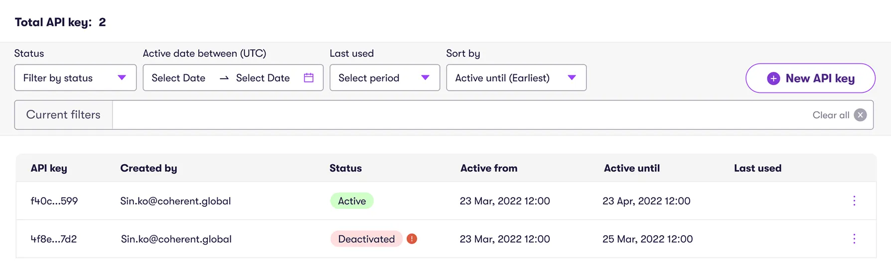
The Experience Before
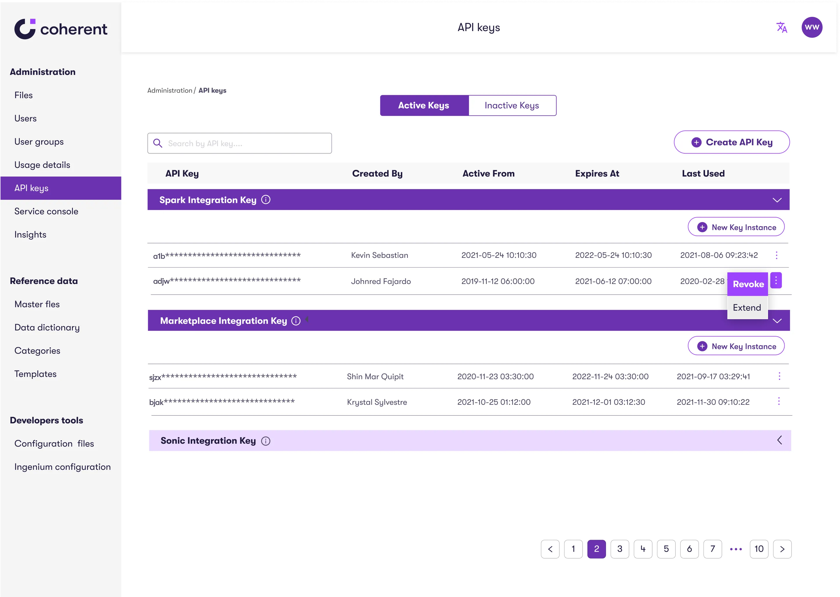
I found it confusing to navigate between active and inactive API keys.
Also, the expand/collapse button is small and not clearly labeled.
IT Systems Administrator
What Users Told Us
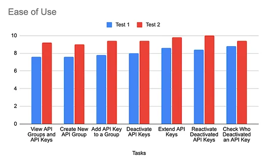
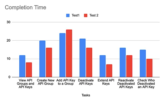
To understand where things broke down, I ran usability tests with five internal users: developers and system admins who worked with the tool every day. We used real-life tasks and visuals to keep sessions grounded and feedback actionable.
Key Tasks:
- View API Groups and API Keys
- Create New API Groups and API Keys
- Deactivate, Extend, and Reactivate API Keys
- Check Who Deactivated an API Key
Key Metrics:
- Ease of Use Rating
- Task Completion Time
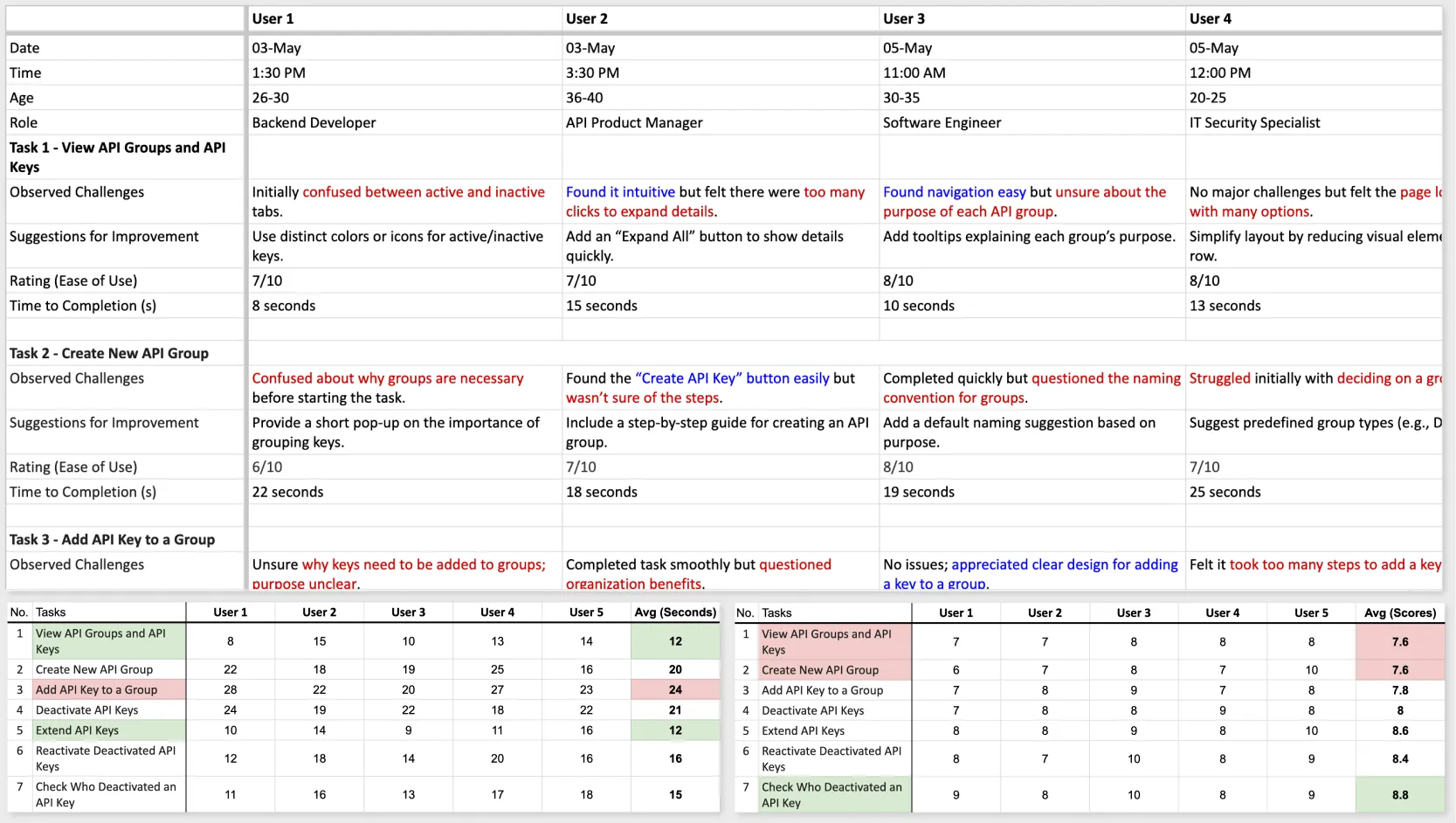
From these sessions, several pain points emerged:
- Labels like “Instance Key” confused everyone
- Had difficulty finding the right key or group quickly.
Naming and Structure
To strengthen our design decisions, I reviewed several API key management tools across the industry. This analysis was guided by two key questions:
1. What naming conventions would be most intuitive for users?
2. What table structure would best support clarity and scalability?
2. What table structure would best support clarity and scalability?
1. Clarify Naming Conventions
Through analyzing other API key management platforms, I identified four common naming conventions:
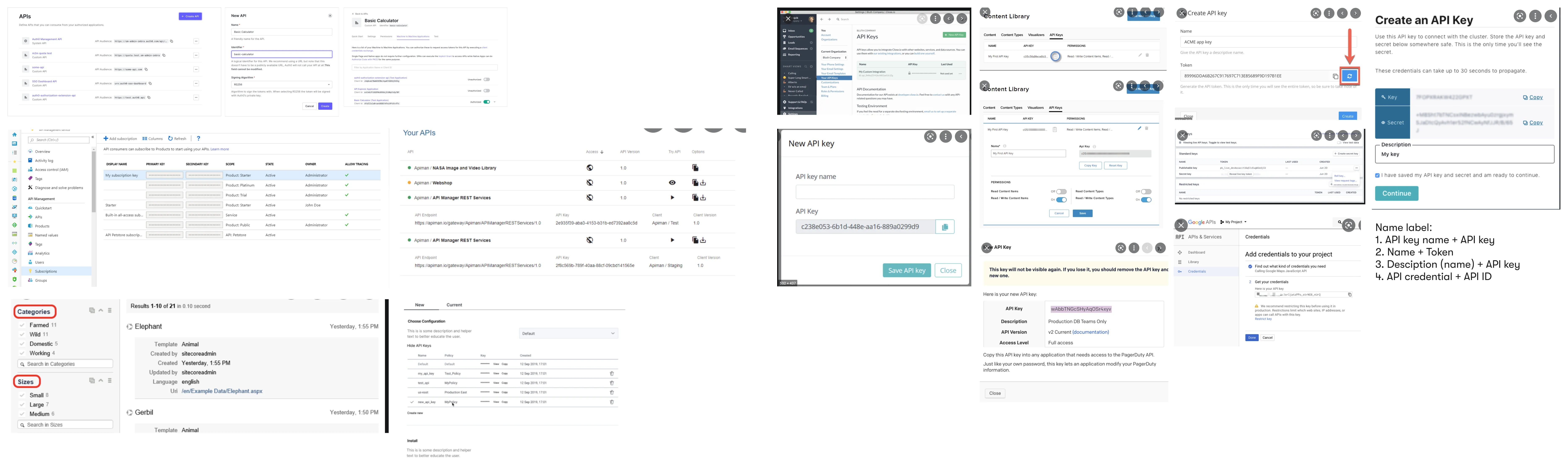
- API Key Name + API Key
- Name + Token
- Description (Name) + API Key
- API Credential + API ID
2. Break Table Structure
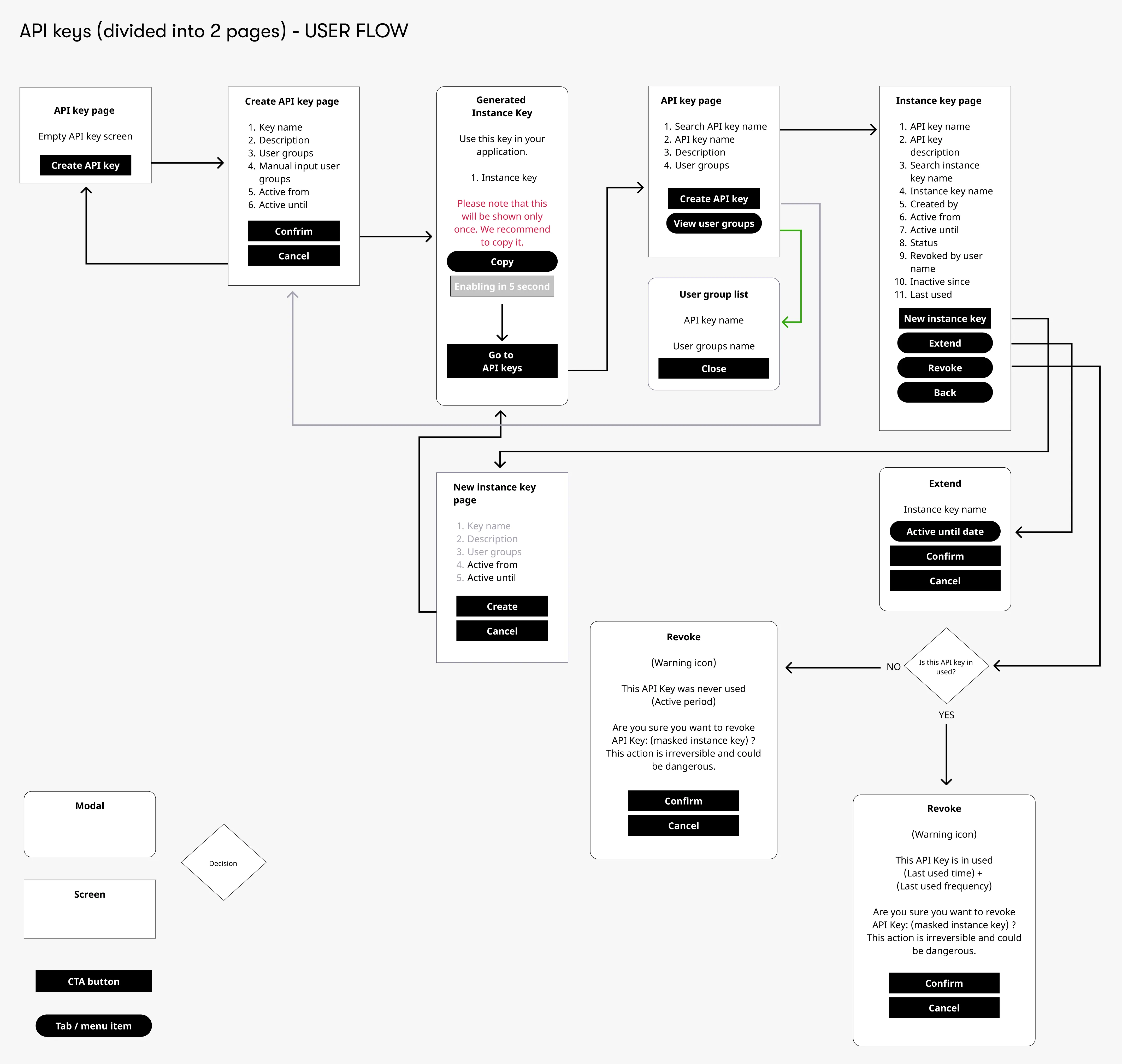
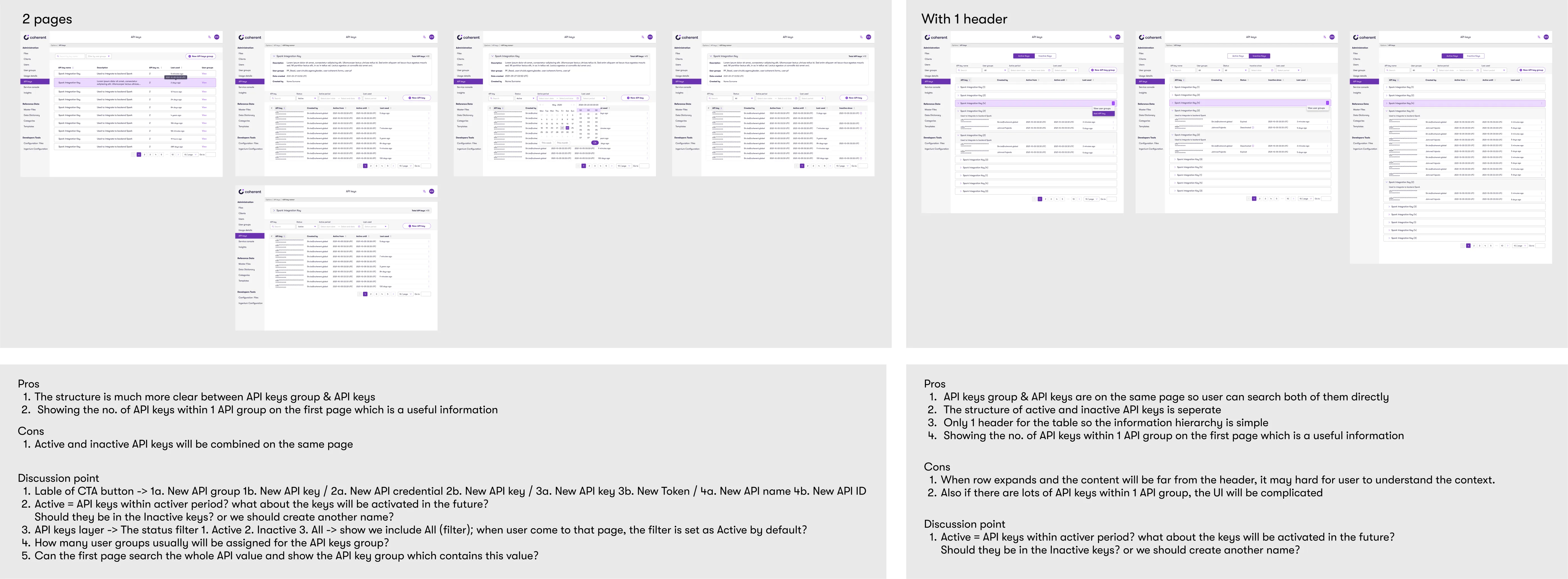
I explored different table structures, including a single-header table, nested tables, and a two-layer layout.
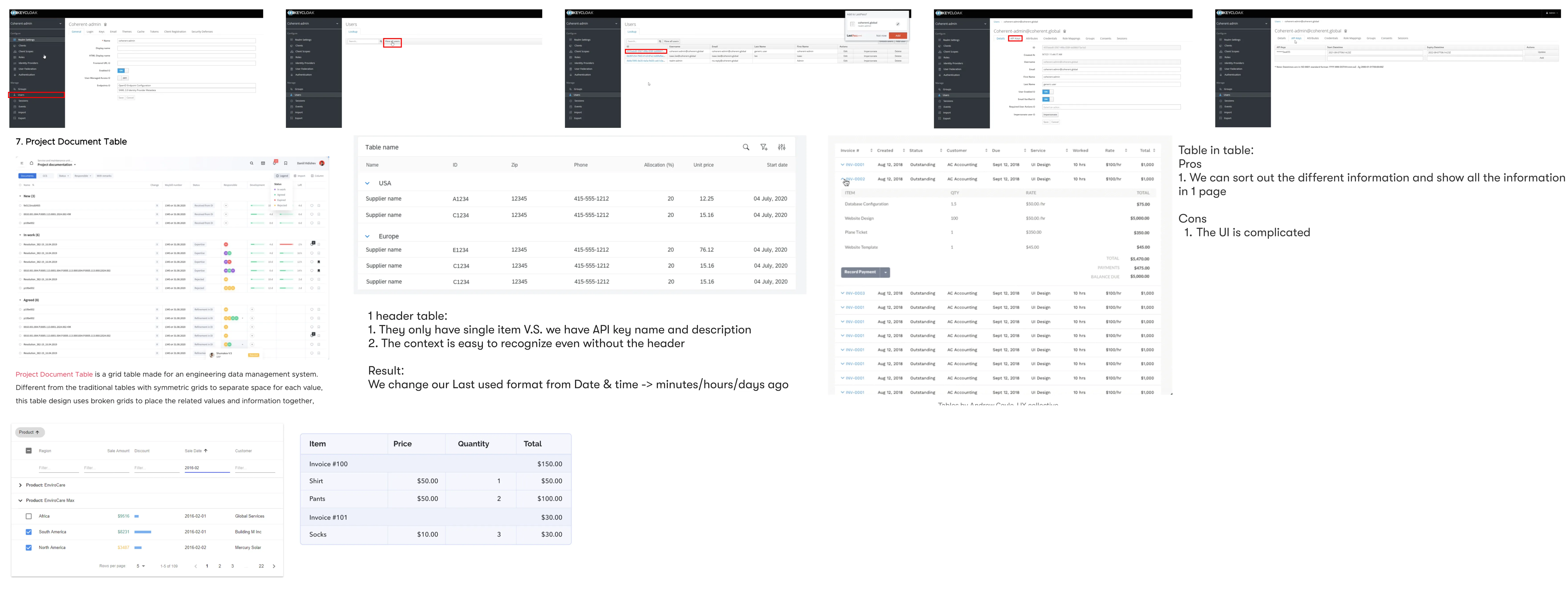
Exploring Table Structures
Since changing the table structure affects user flow, I mapped out two user flows and collaborated closely with our senior designer and PM to evaluate both.
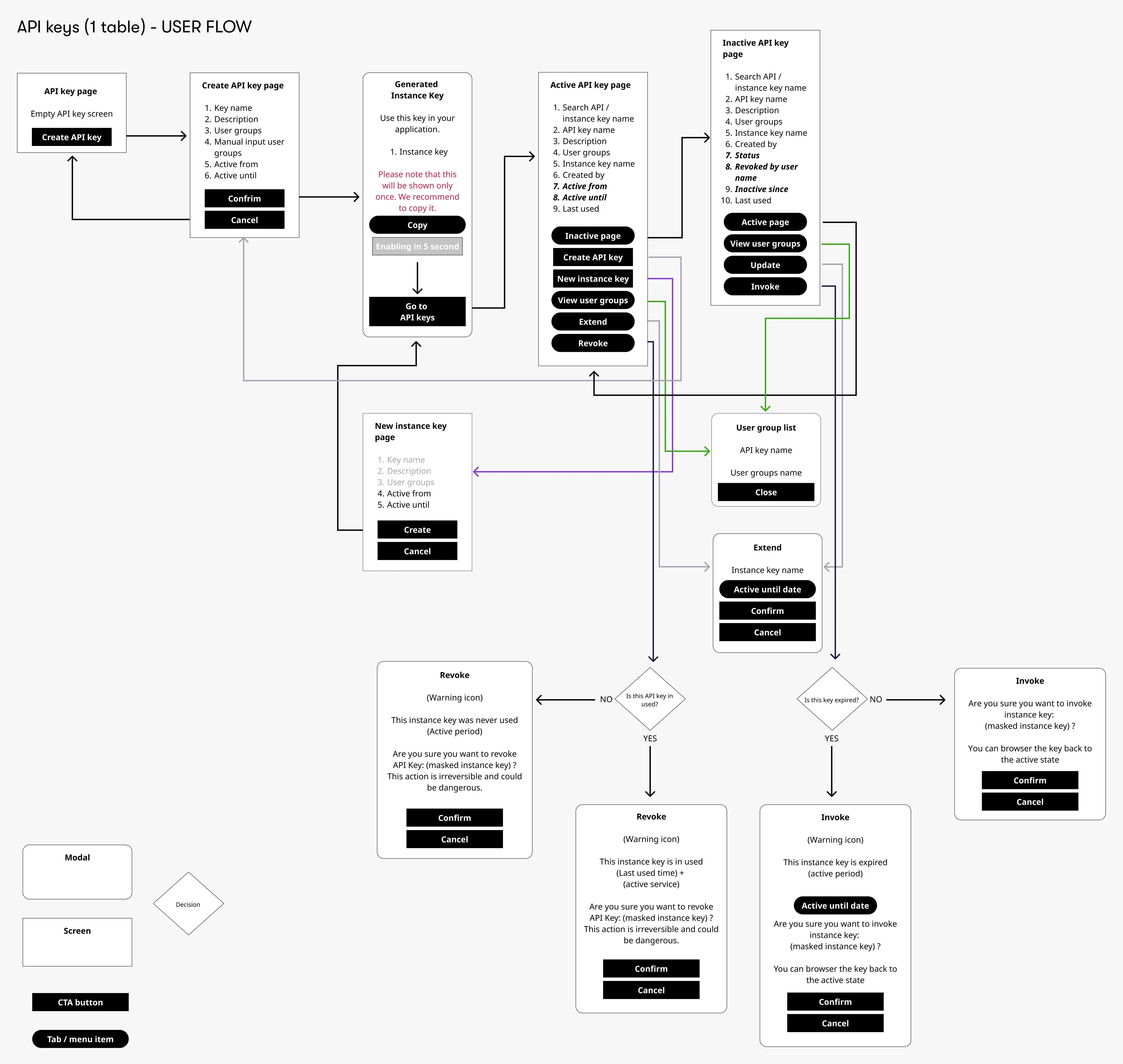
Communication Gap
During a review with the CTO and development team, we realized the user flows alone didn’t fully convey the concept.
To bridge that gap, I prepared:
To bridge that gap, I prepared:
- Visual mockups to complement user flows and make concepts easier to understand for non-design stakeholders
- A pros and cons comparison for two structural layouts (two-page vs. one-page nested)
- Discussion prompts focused on naming conventions, user expectations, and interaction clarity
- A scalability and feasibility analysis based on user flows and potential engineering impact
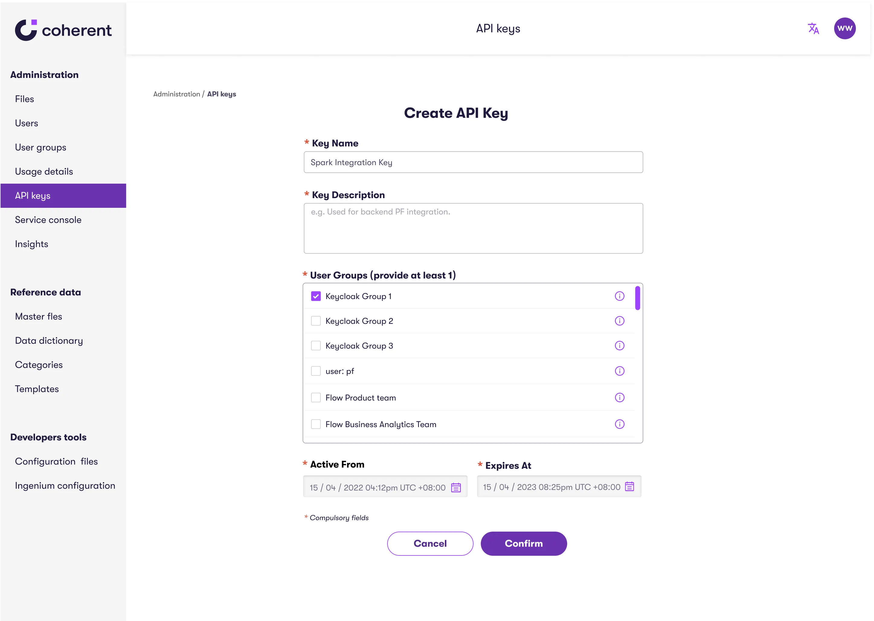
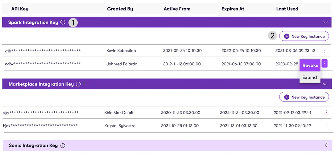
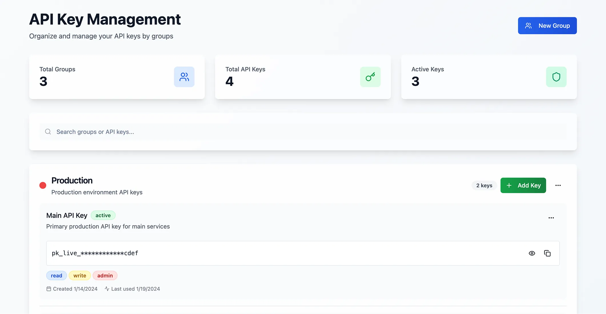
I led the effort to standardize the terminology, replacing the confusing “Instance Key” with clearer, more intuitive labels: “API Key Group” and “API Key.”
I also advocated for a two-layer structure, prioritizing clarity and scalability over minimizing clicks. This improved navigation flow made it significantly easier for users to manage complex API environments.
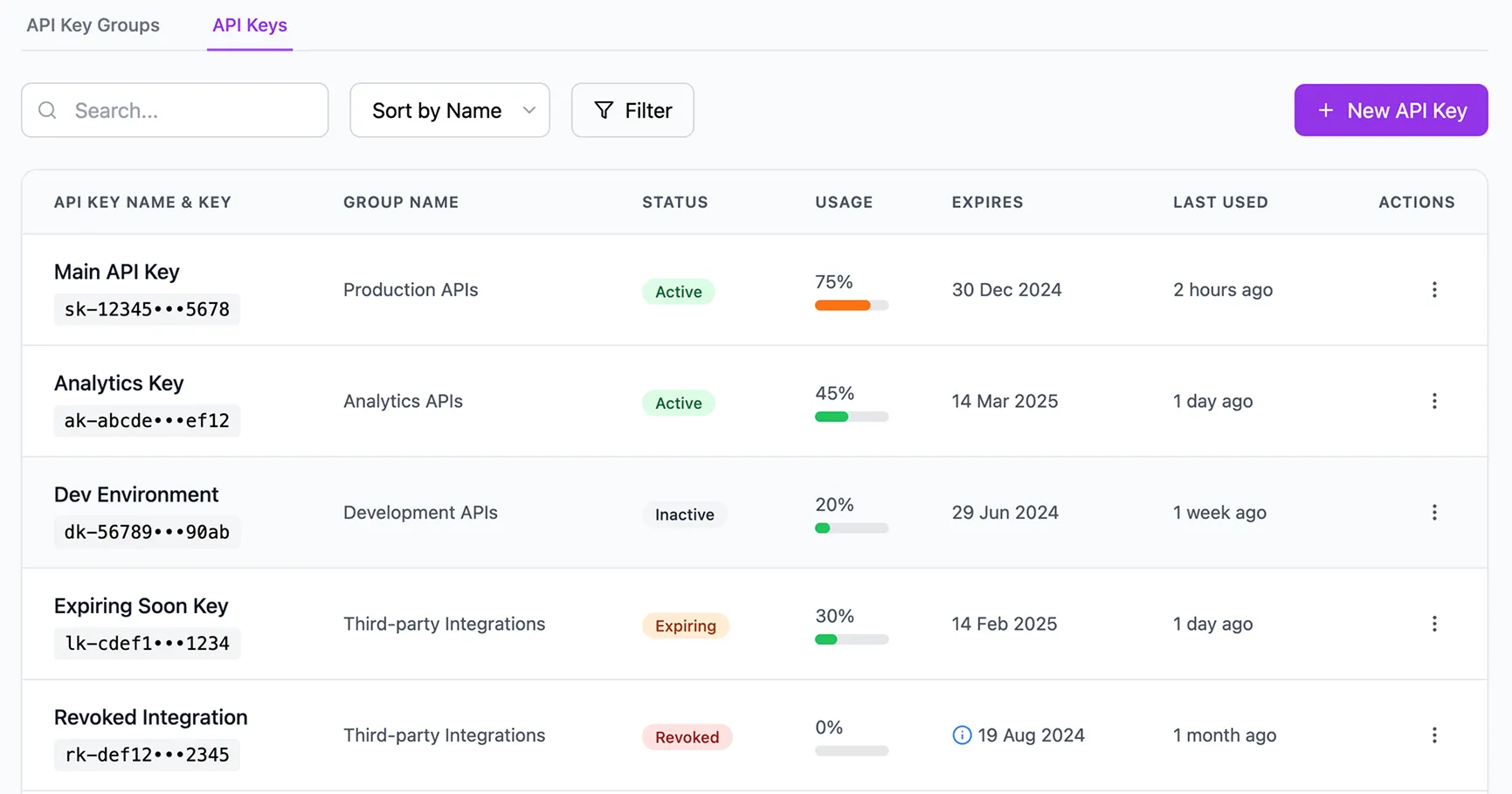
UI/UX Improvements
1. Making Navigation Clearer and More Contextual
Before:
- Disjointed grouping separated active and inactive keys
- Search was limited to individual API keys, not groups
- Labels like “Create API Key” lacked context
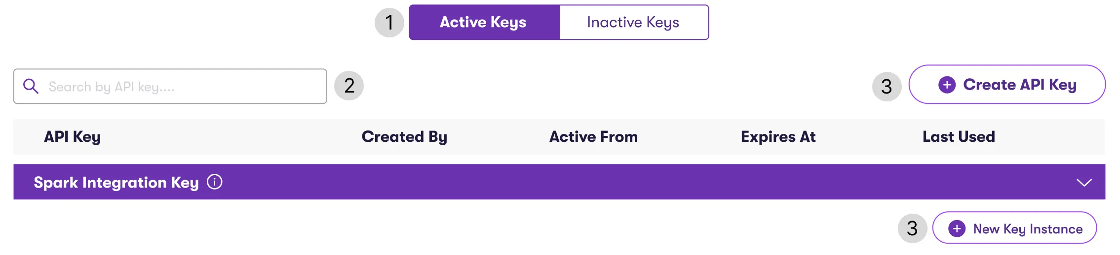
After:
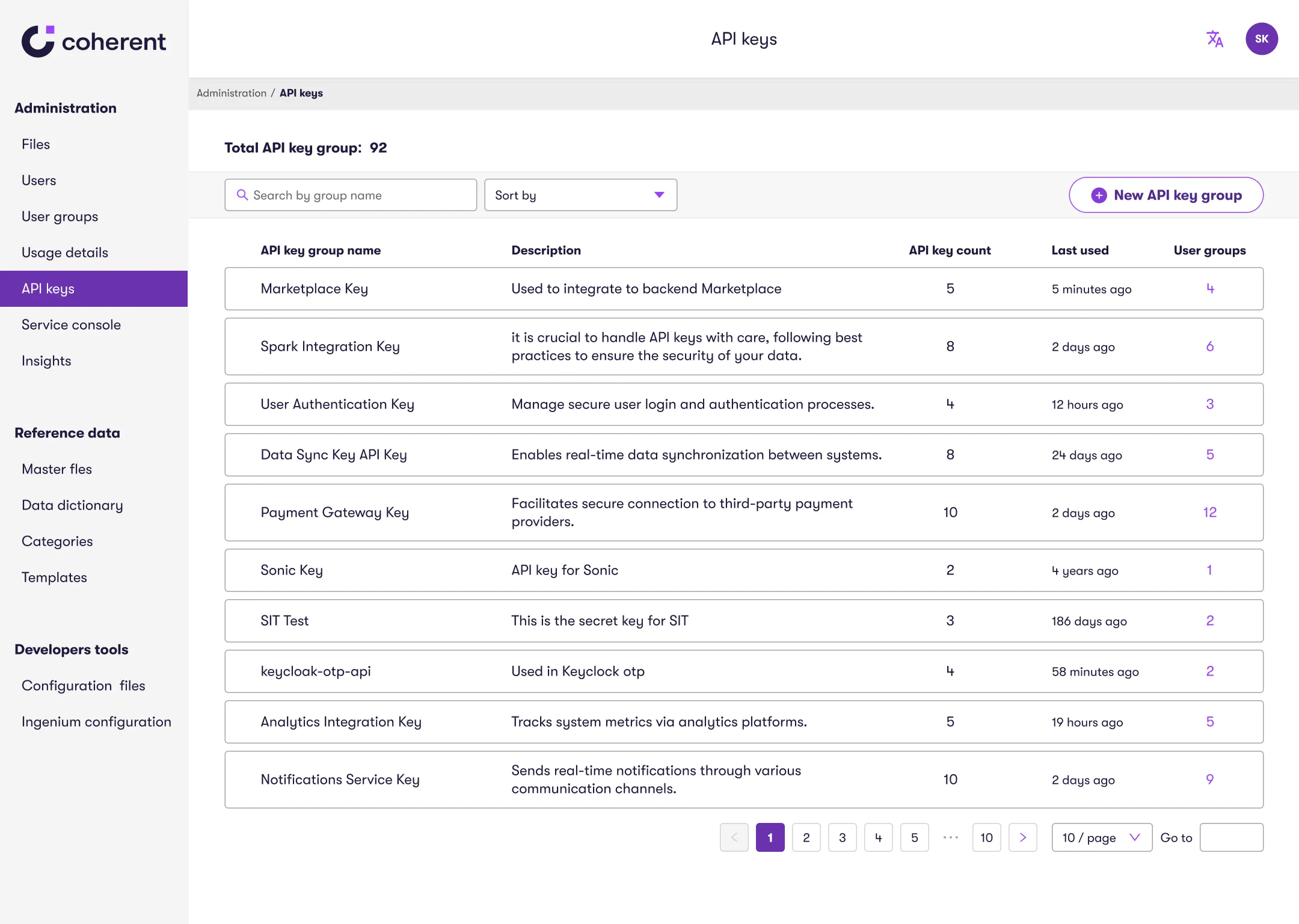
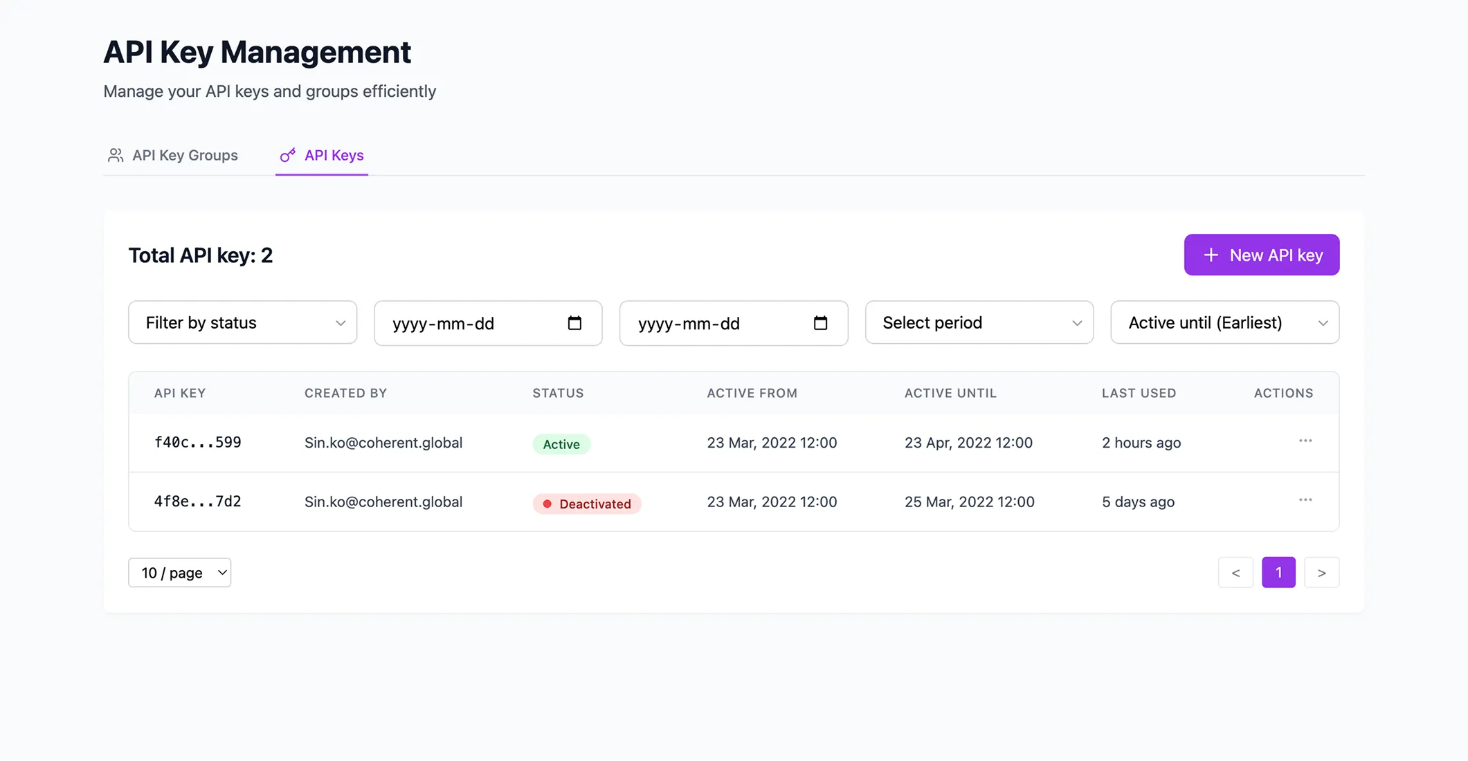
- Group views now display total key counts and linked user groups
- Users can search API key groups directly
- Labels were renamed for clarity, such as “New API Key Group”
- Dates are formatted as “Time Ago” for faster scanning
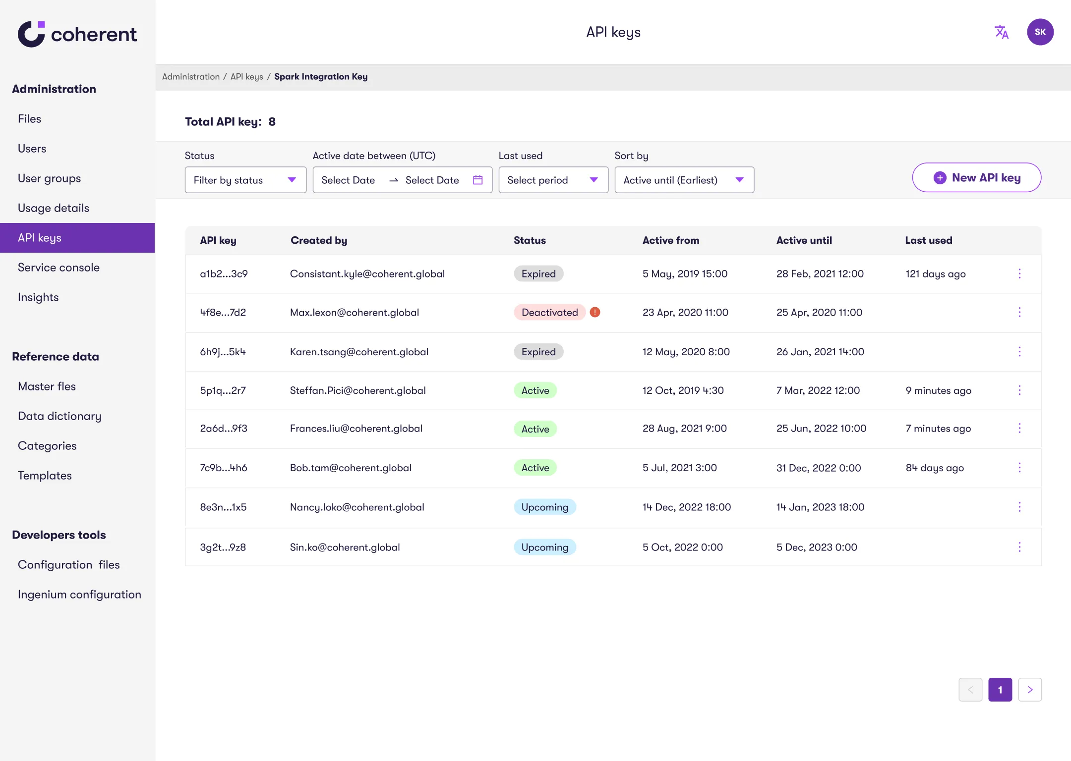
2. Clarifying Structure to Support Fast Access
Before:
- All API keys were managed on one page, causing dense, hard-to-scan layout
- Expand/collapse sections made it visually overwhelming and slowed users down when searching for a specific key or group
After:
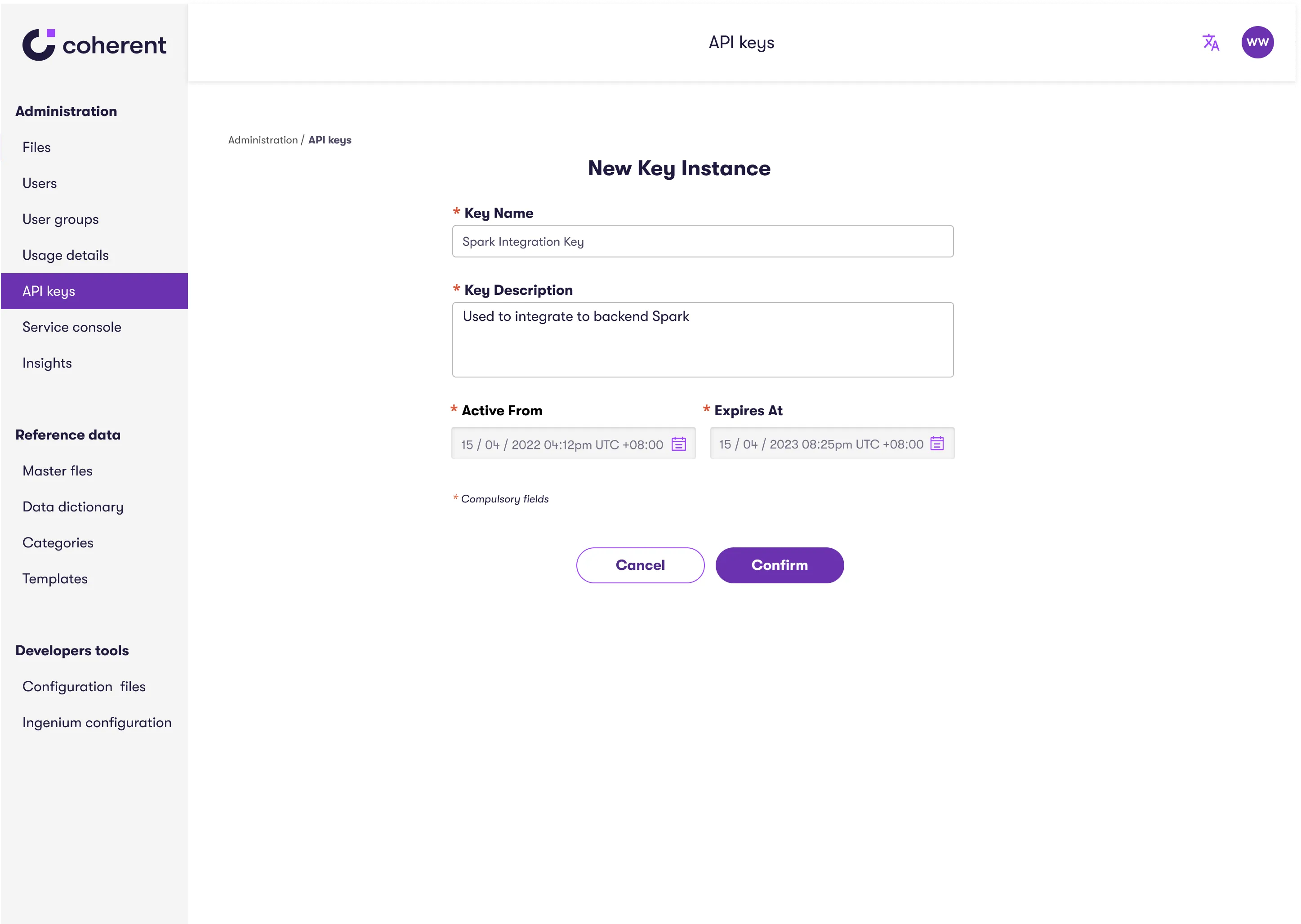
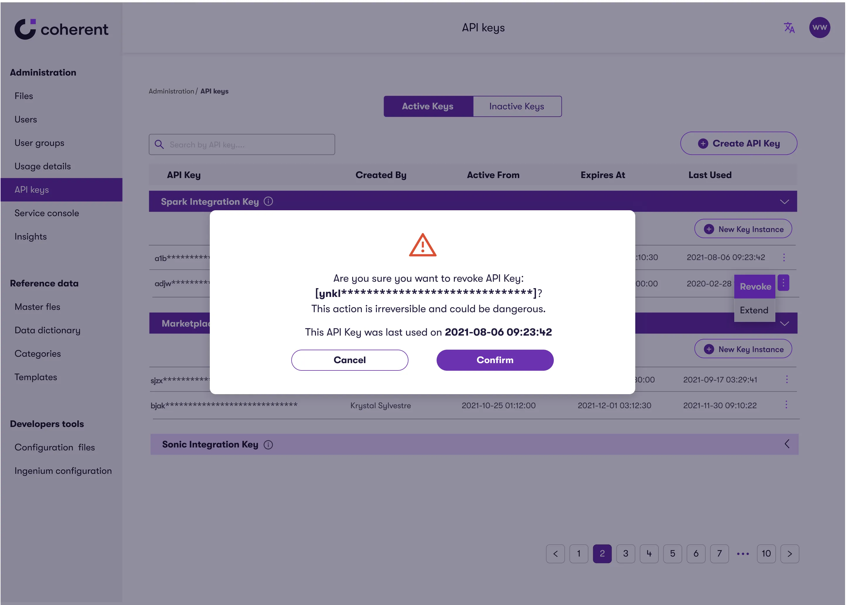
- Introduced two-layer navigation for better structure
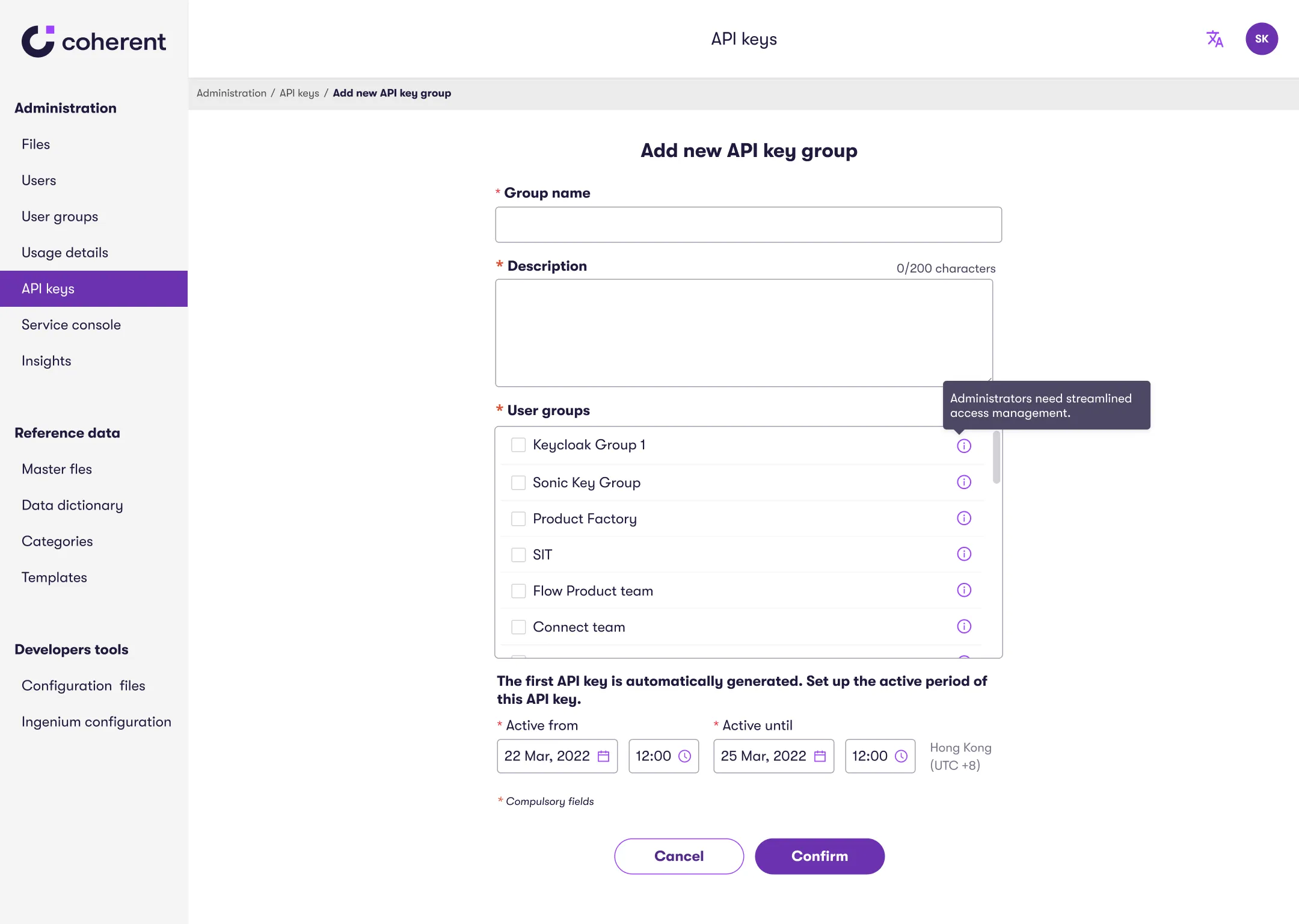
- Users can now create keys directly within their group view
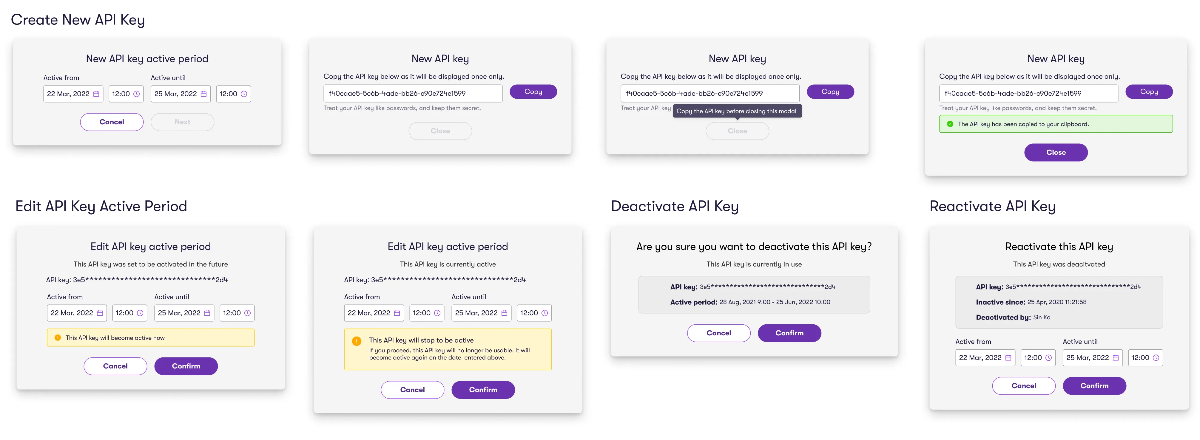
- A modal-based flow streamlines key creation without disrupting tasks
3. Additional UX Enhancements
Users often struggled with key management tasks due to poor workflow continuity.
To resolve this, I introduced a modal-based interaction model that allowed users to complete key actions such as creating, editing, deactivating, or reactivating keys directly within the same view.
Accessibility Audit
While applying components from our design system to the new interface, I noticed that some states and color choices didn’t meet WCAG 2.1 accessibility standards.
I proposed an accessibility audit to my design lead, which was approved. After the audit, I translated the findings into structured Jira tickets with clear, actionable requirements.
I presented the findings to the design and development teams, as well as the CTO, which led to the adoption of accessibility best practices.
I then updated and contributed enhancements to our shared design system, improving component accessibility and reusability across multiple teams.
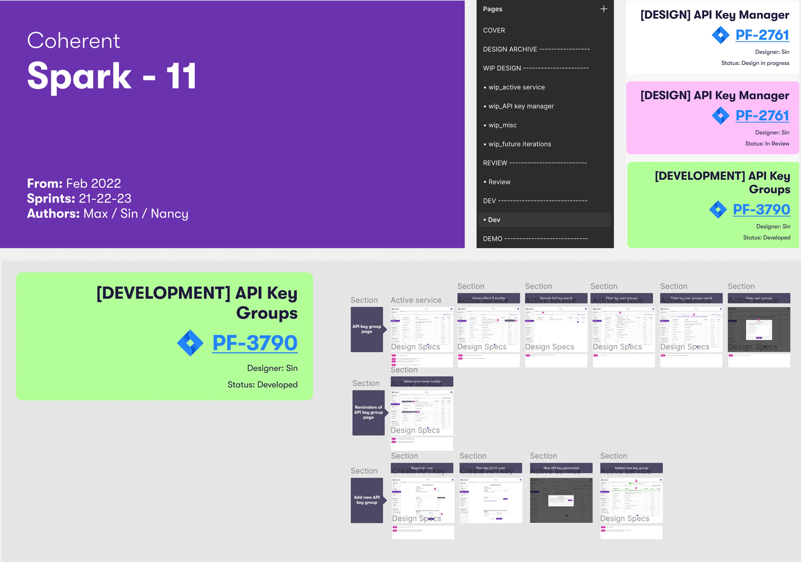
Cross-Functional Collaboration
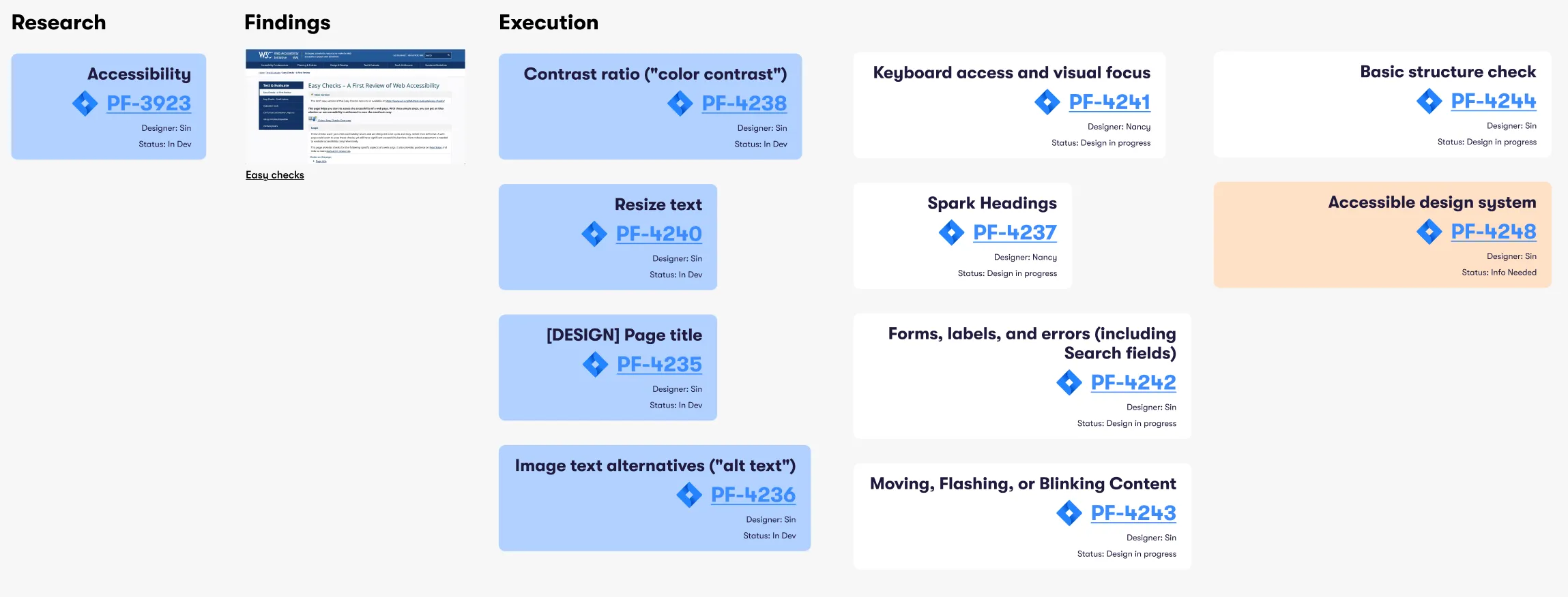
Our team used structured sprint summaries to track design specs, development progress, and cross-functional ownership. These summaries included detailed status updates, linked Jira tickets, and annotated thumbnails for key features.
Selected New Design
The UI looks more polished, and searching for API keys is much easier.
Filtering by status in one view is a major improvement—I no longer have to switch between pages.
Software Engineer
Usability Improvements
16%
Ease of use rating increase
Previously, users struggled with unclear navigation and fragmented workflows, leading to frustration and an ease-of-use rating of 8.1/10.
The redesign streamlined the experience, eliminating unnecessary steps and boosting ease-of-use to 9.5/10.
The redesign streamlined the experience, eliminating unnecessary steps and boosting ease-of-use to 9.5/10.
21%
Reducing time to complete the tasks
Before, inefficient workflows slowed users down, with an average task time of 17.1s.
With a more intuitive UI and clearer interactions, task completion time dropped by 21% to 13.6s, allowing IT teams to manage API keys with ease.
With a more intuitive UI and clearer interactions, task completion time dropped by 21% to 13.6s, allowing IT teams to manage API keys with ease.
Business Impact
The improved API Key Management experience helped position Spark’s platform for enterprise growth and API monetization by streamlining workflows and enhancing usability.
These milestones reflect the value of an intuitive, scalable product experience in driving platform adoption and partner engagement.
These milestones reflect the value of an intuitive, scalable product experience in driving platform adoption and partner engagement.
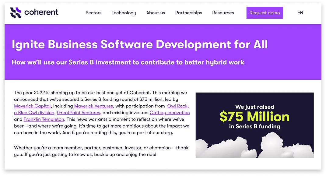
USD
$75M
Series B funding
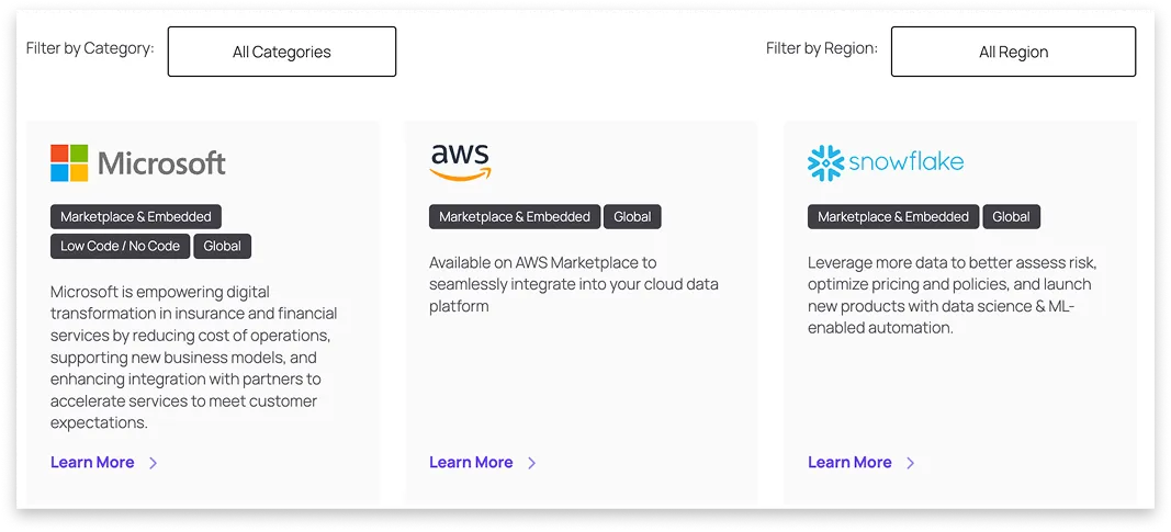
20+
Partners
Including Snowflake, AWS and Microsoft
Forward-Looking Metrics
To measure long-term impact, I recommended tracking:
To measure long-term impact, I recommended tracking:
- User retention across API management tasks
- API usage volume tied to platform revenue
- Support ticket volume related to key management and navigation
My Growth
Stepped out of my comfort zone by presenting design changes directly to the CTO and developers. I was nervous about naming changes and technical terms, but explaining my reasoning helped gain alignment.
Led our first accessibility audit for the design system. I identified issues, created an epic with Jira tickets, and presented findings to cross-functional teams.
Encouraged adoption of WCAG 2.1 standards, helping shift team mindset around accessibility and long-term quality.
I learned the value of taking initiative, asking questions even when unsure, and owning work that drives real change.
What if I Redo it Today with AI?
In 2025, I decided to give this case study a second life with a twist. My goal was not to replace my work, but to challenge it:
- Curiosity: Could AI make it faster, better, more engaging?
- Goal: Test its limits and use it in a real design deliverable.
I treated this AI experiment like a design sprint, starting with idea generation, testing multiple tools, and finally integrating the best ones into my process.

Ideation with Claude
I uploaded my original design to Claude and asked for suggestions, then requested new visuals based on its recommendations.
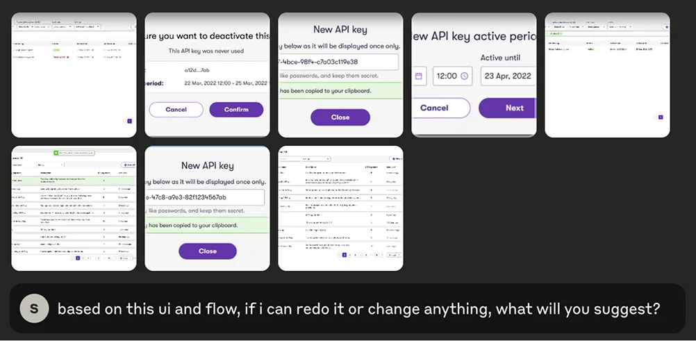
As you can see, Claude proposed several changes. The three that stood out most and aligned best with the project’s scope and scalability were:
- Unified dashboard for keys and groups
- Usage analytics (daily requests, last used)
- Health indicators (status, expiry, rate limits)
AI Tools Exploration
I tested four tools: V0, Lovable, Bolt, and UX Pilot. To ensure a fair comparison, I used the same prompt and original design for each tool.
I used two approaches:
I used two approaches:
- Text prompt only: "I want to build API key management with API key groups and individual keys."
- Prompt plus image: "Based on my API key management UI and user flow, can you suggest and create a better UI and UX flow?"
For ideation, I found that text-only prompts gave me more surprising and diverse results. When I included images, most AI tools were able to match the structure or flow, but the visual style and components often didn’t align with my original design.

| Criteria | V0 | UX Pilot | Lovable | Bolt |
|---|---|---|---|---|
| Free daily credits for iteration | ✅ | ❌ | ✅ | ✅ |
| UI consistency with original design | ❌ | ❌ | ❌ | ✅ |
| Scalability of design | ✅ | ❌ | ✅ | ✅ |
| Creative layout ideas | ✅ | ✅ | ✅ | ✅ |
| Interactive layer suggestions | ❌ | ❌ | ✅ | ✅ |
| Usable output for prototyping | ❌ | ❌ | ✅ | ✅ |
Note: This evaluation is based on my experience with a specific case study and may vary with different projects or prompts.
I used Claude to ideate the interaction flow for how users add, view, and manage API keys and groups. To work around Claude’s limited conversation length, I broke the flow into smaller parts.
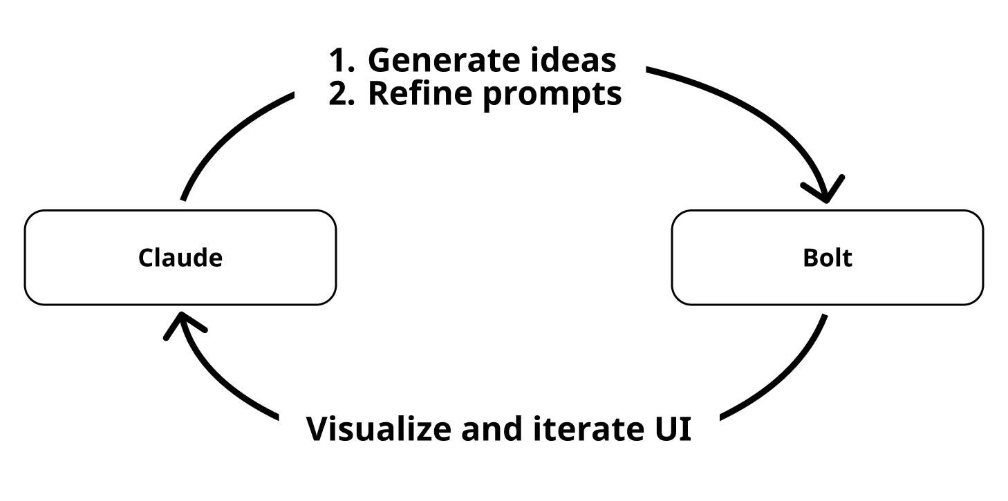
I used Claude and Bolt in a loop to ideate, refine, and visualize small batches of UI.
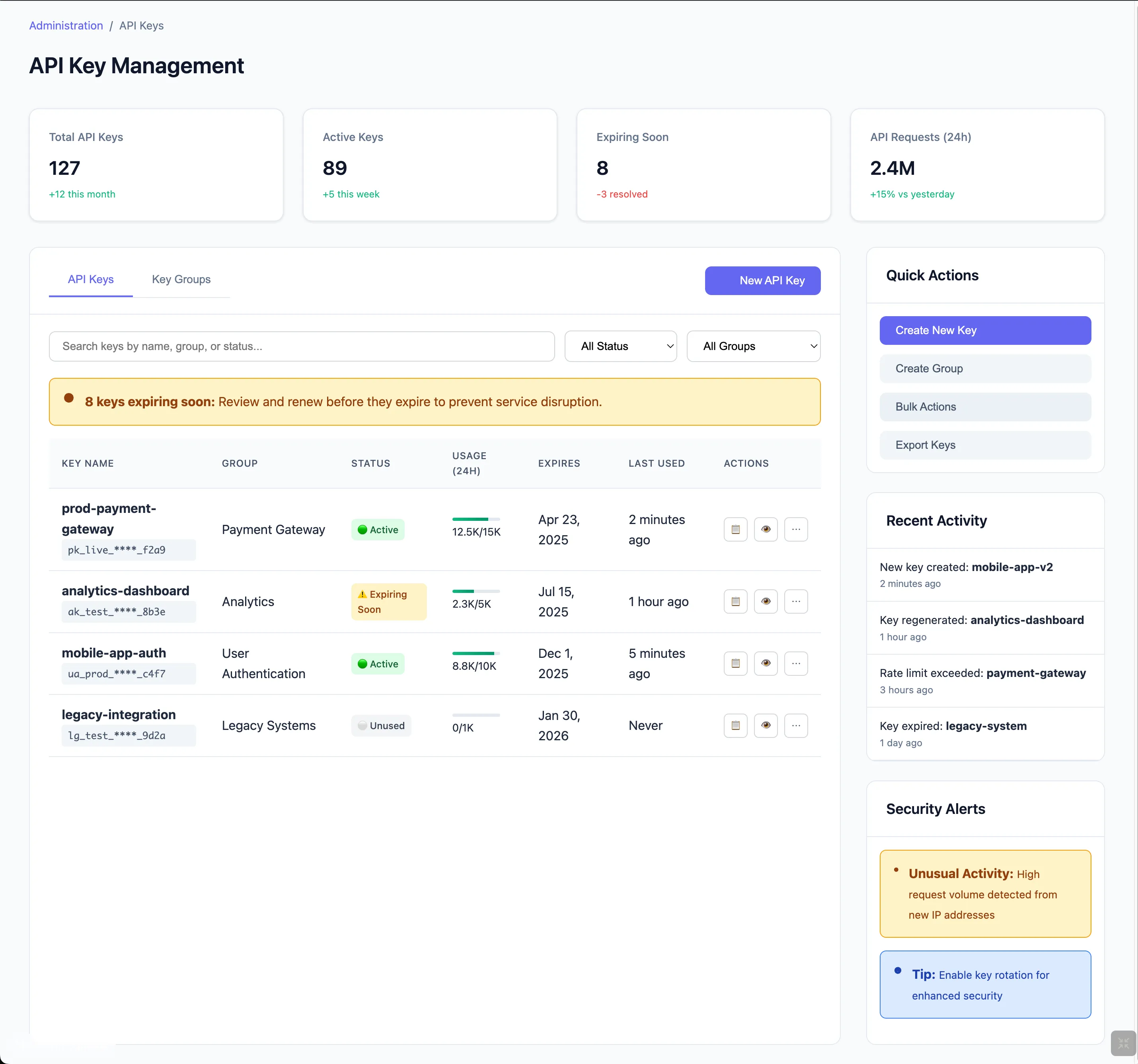
New AI Design
1. Dashboard-Level Overview & Combined View with Tabs
Before:

- Users only saw a plain count of API key groups with no contextual insights
- API groups and keys lived on separate screens made it harder to see relationships and slowed down management
After:
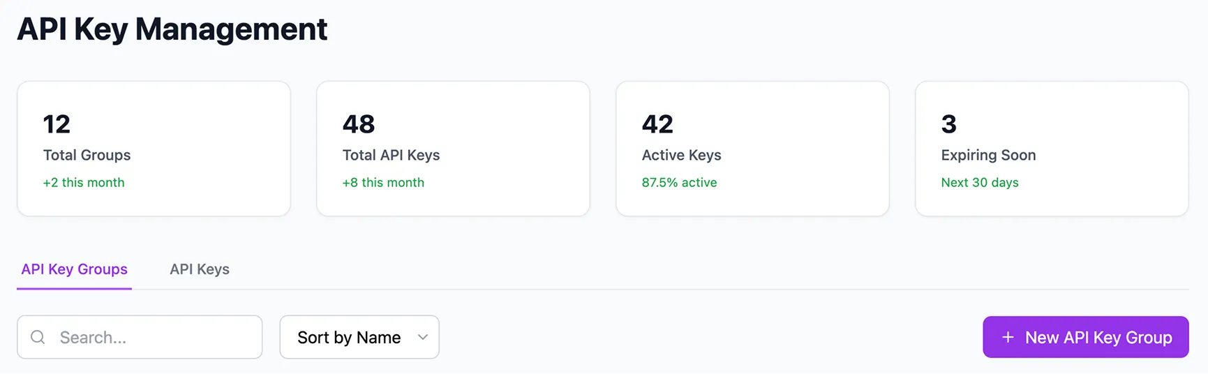
- Dashboard at the top highlights key metrics, gives users immediate insight into system health
- Tabs were added to unify API key groups and individual keys, making navigation faster without losing context
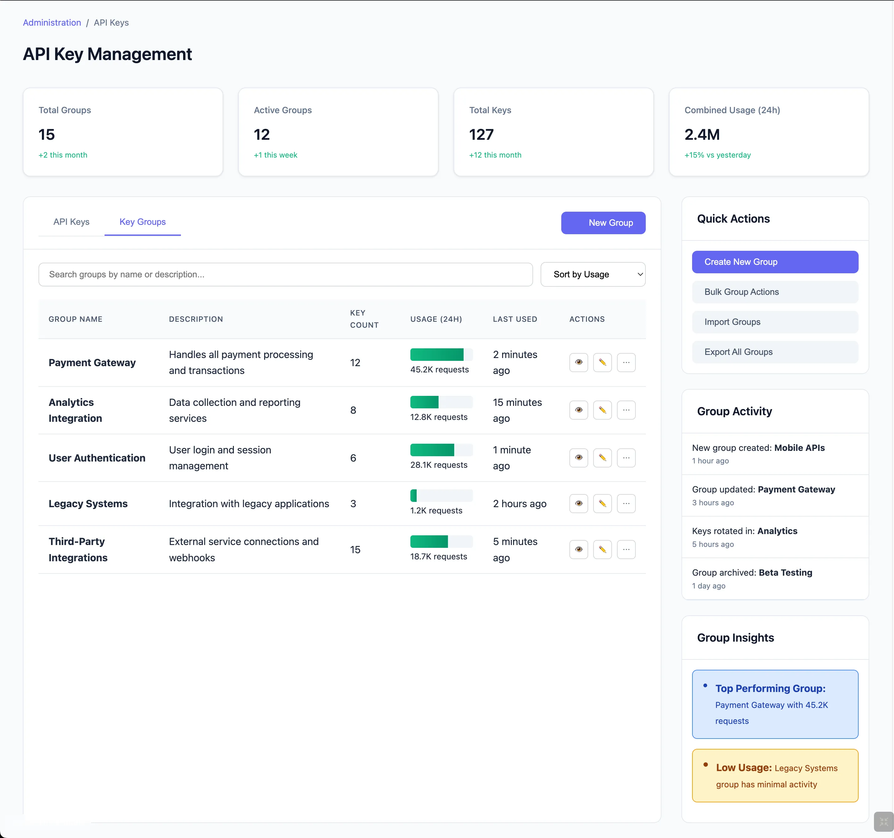
2. Visual & Context Enhancements in Tables
Before:
- The lack of key names made it hard to identify what each key was for
- Date and creator info lacked key-level clarity
After:
- Showing the key name with its group makes searching and scanning easier
- The usage bar especially helpful for power users managing many keys
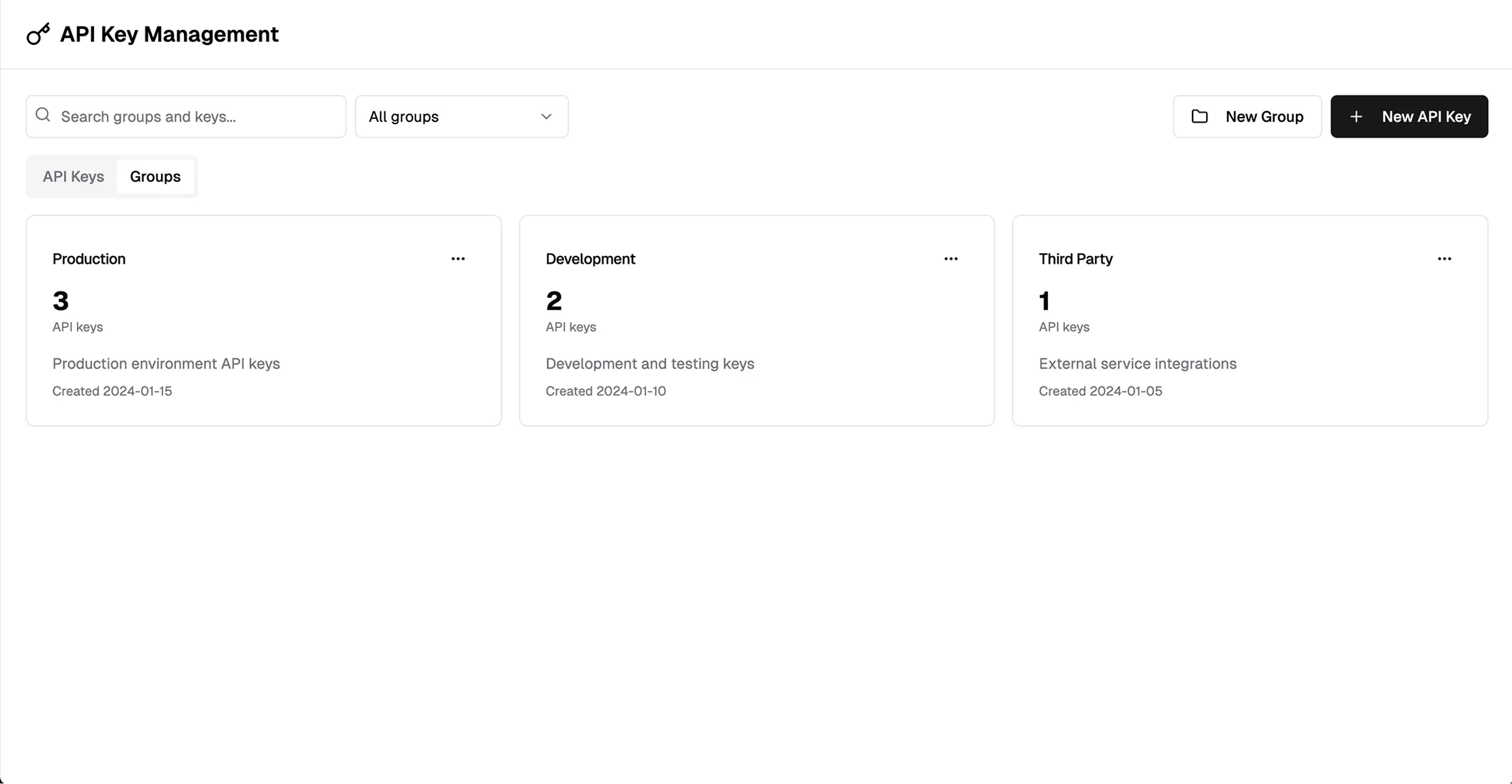
3. Side Drawer for API Group Details
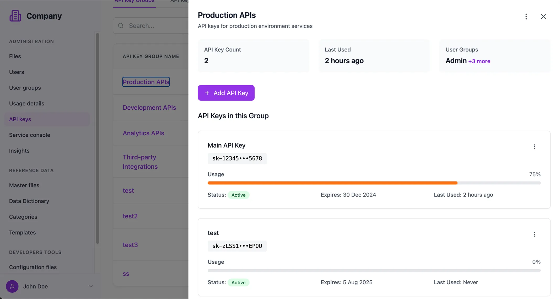
I replaced the full-page transition with a side drawer when viewing API group details. This allows users to stay in flow, compare across groups quickly, and avoids unnecessary page loads.
Key Takeaway
You can explore the live version: https://tinyurl.com/y2bs5jyp
✅ What Worked
- 40% faster workflow: AI tools helped accelerate research, ideation, and early UI generation.
- Stronger ideation: Especially effective in generating interaction concepts and layout variations.
⚠️ Limitations
- Manual refinement needed: AI-generated UI still required design polishing and adjustments.
- Prompt crafting was a challenge: Especially when switching between AI tools and Figma to conserve tokens.
- No design system integration: Output didn’t follow our UI components or style guide.
- Scaling inconsistency: When prompts had too many requirements, Bolt didn’t apply changes consistently.
💡 Opportunities & Solutions
- Use MCP (Model Customization Platform): — To apply consistent UI components and align with the design system.
- Write a detailed PRD: Clear, structured requirements improve AI prompt results and reduce back-and-forth.
- Explore AI’s scalability limits: Still unsure how well AI handles ongoing requirement changes in real-world projects.
