Coherent.2020
Facilitating Retirement Planner Development
Our team was brought in by a major insurance company to redesign a retirement planning tool. As an external agency, we were tasked with creating a user-friendly web and iPad experience that served two distinct audiences: advisors and clients.
I led usability testing from preparation to analysis, working with stakeholders to refine the calculator based on real user feedback.
Deliverable
Usability Testing (Remote)
UX & UI Refinement
Presentation
UAT Testing
UX & UI Refinement
Presentation
UAT Testing
Team
2 Actuaries
Project Manager
Head of Design
Developer
Project Manager
Head of Design
Developer
Impact
OVER 90%
Advisors actively used
+24%
Usability score increase
81%
Overall satisfaction score
TL;DR
We partnered with a major insurance company to improve their retirement planning tool for advisors and clients across web and iPad.
Through two rounds of remote usability testing, I uncovered key friction points, from vague labels to inefficient data input, and helped turn real user feedback into focused UX improvements.
Changes like clearer search results, simplified product details, and in-context editing led to a 24% increase in usability and an 81% client satisfaction score.
Remote testing also taught me how to manage technical challenges, navigate emotionally charged feedback, and turn observations into product decisions.
Project Context
I was building a retirement planning tool designed to help advisors guide clients in identifying retirement gaps and recommending suitable financial products.
My goal was to validate whether users could complete key workflows without confusion or frustration.
For advisors, I tested workflows such as:
- Searching and creating client profiles
- Reviewing projections
- Updating data efficiently
For clients, I focused on:
- Updating their information
- Finding or contacting an advisor
This usability test aimed to uncover any friction points, misunderstandings, or inefficiencies that could impact user adoption, satisfaction, or task success at launch.
The Experience Before
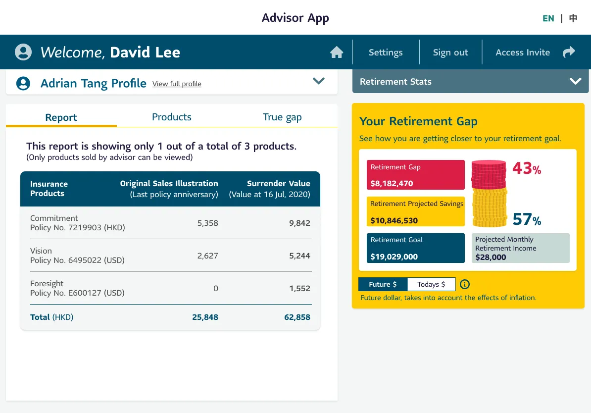
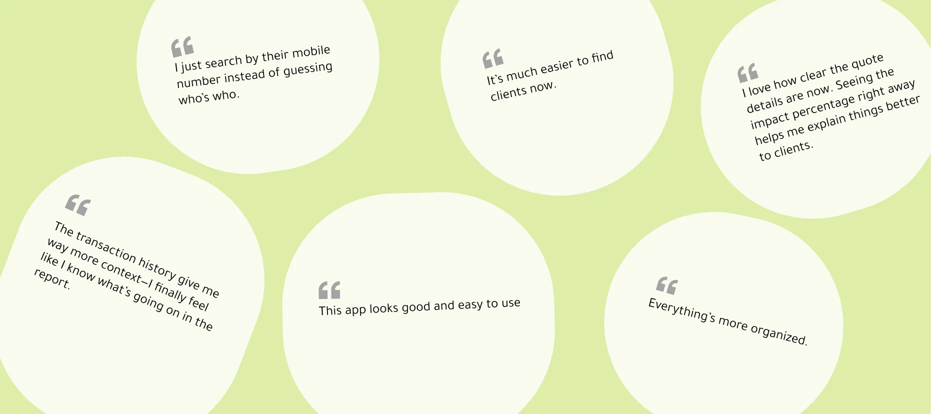
I’d prefer to search for clients using their mobile phone number. And the Quote Summary is too general.
Mandy Wong
Advisor
Advisor
Remote Usability Testing Setup
To validate my design before launch, I ran two rounds of remote usability testing using Zoom.
01
I used a responsibility checklist to coordinate tasks & communication.
02
Task scenarios were grounded in real use cases, supported by visuals to help participants stay immersed.
03
Before the full test, I ran a pilot session to refine the flow and troubleshoot any technical issues.
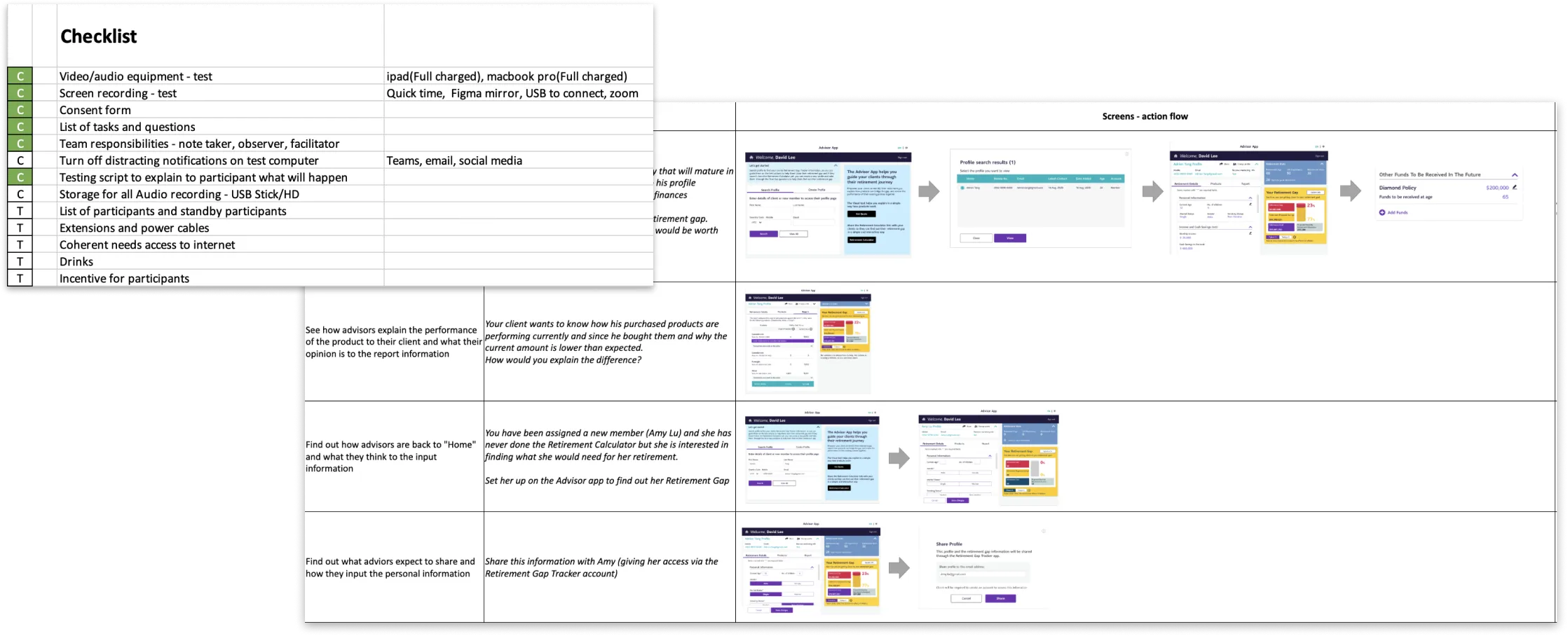
Tools & Materials
Participants:
- Round 1: 6 Advisors
- Round 2: 6 Advisors + 6 Clients
- Total: 12 Participants
Tools & Materials
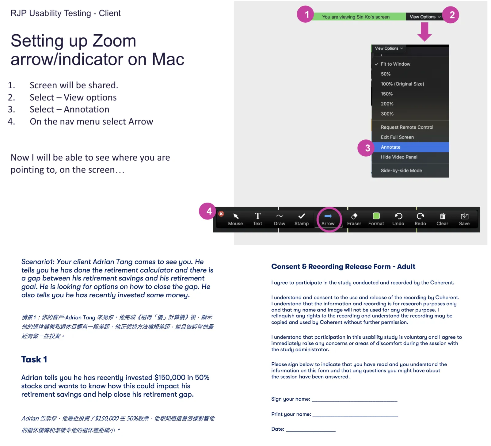
- A step-by-step Zoom setup guide with screenshots for screen sharing and mouse tracking.
- Task scripts to ensure consistency across sessions.
- Consent forms and privacy agreements to follow ethical testing practices.
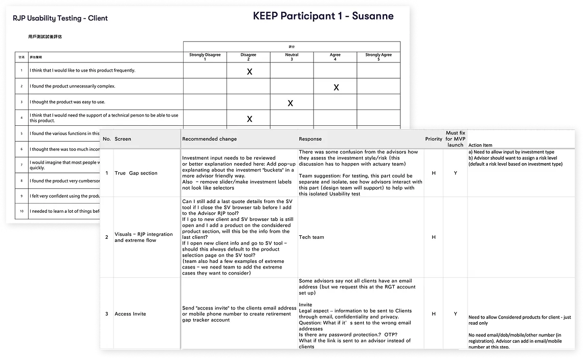
Evaluation: From Observations to Action
01
I collected task success scores, participant comments, and post-task surveys.
02
Feedback was consolidated to identify recurring usability issues and misalignments with user expectations.
03
I collaborated with stakeholders to prioritize fixes based on impact and feasibility.
Before & After
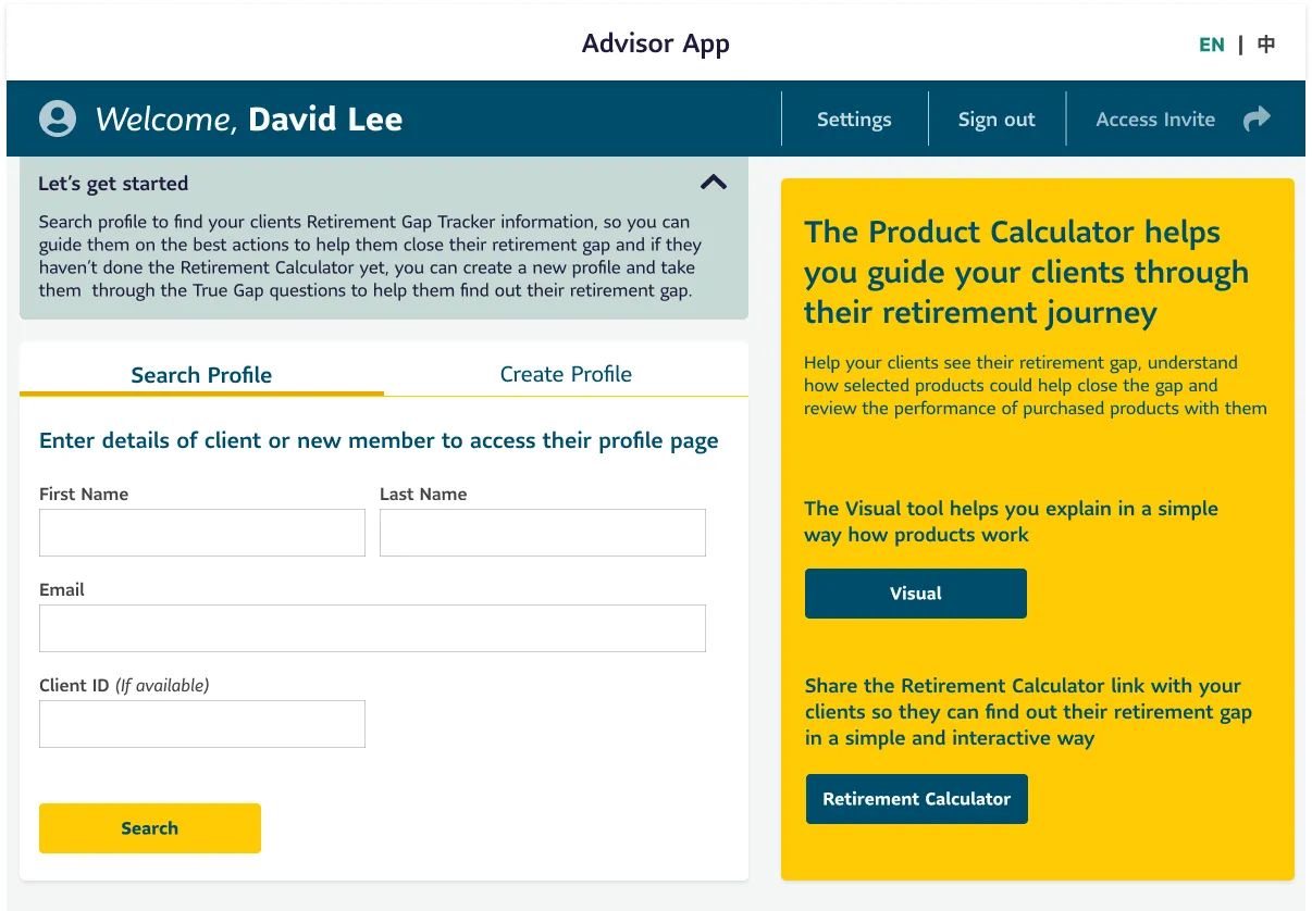
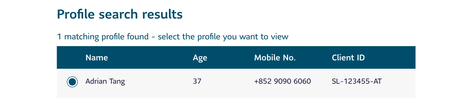
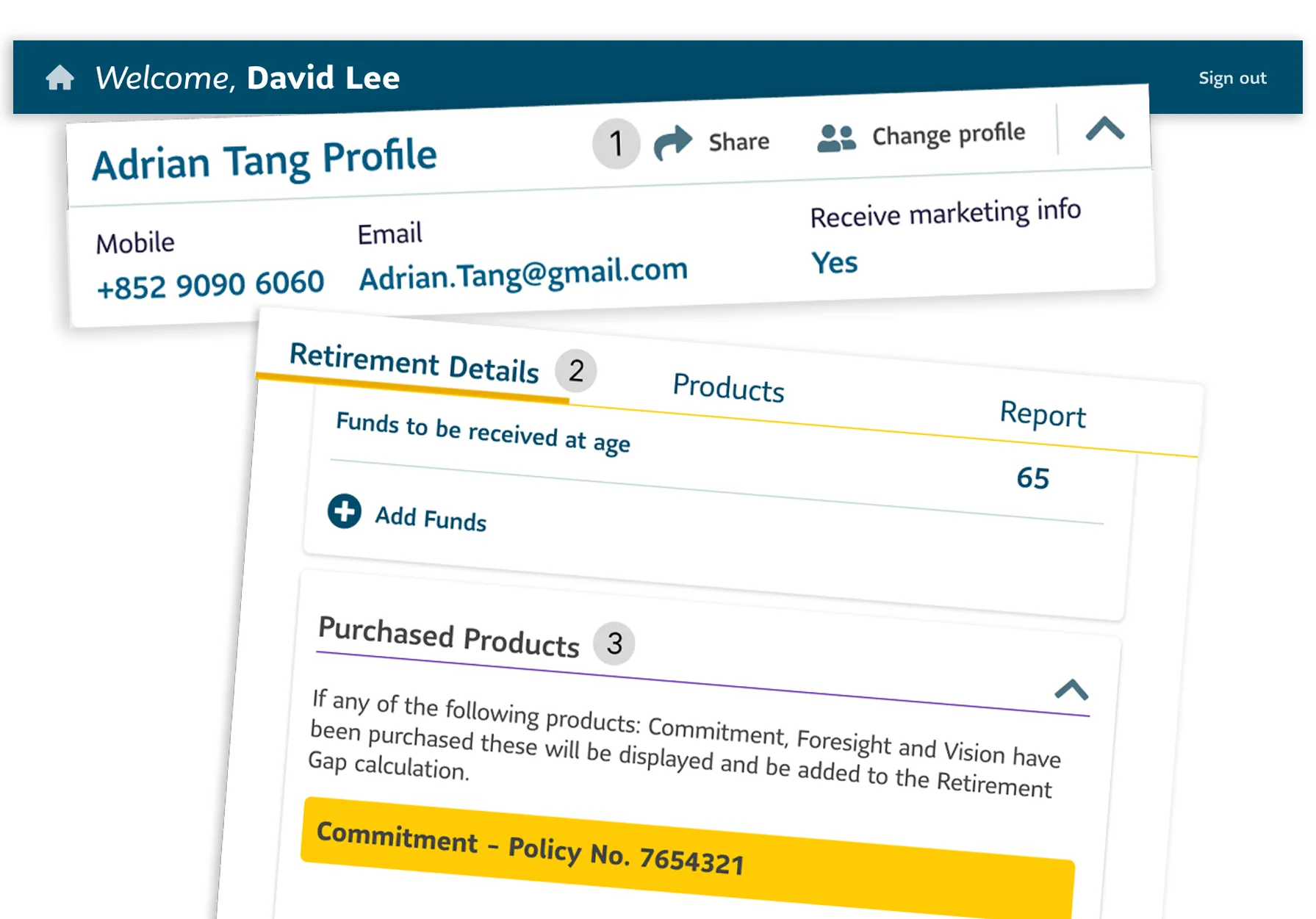
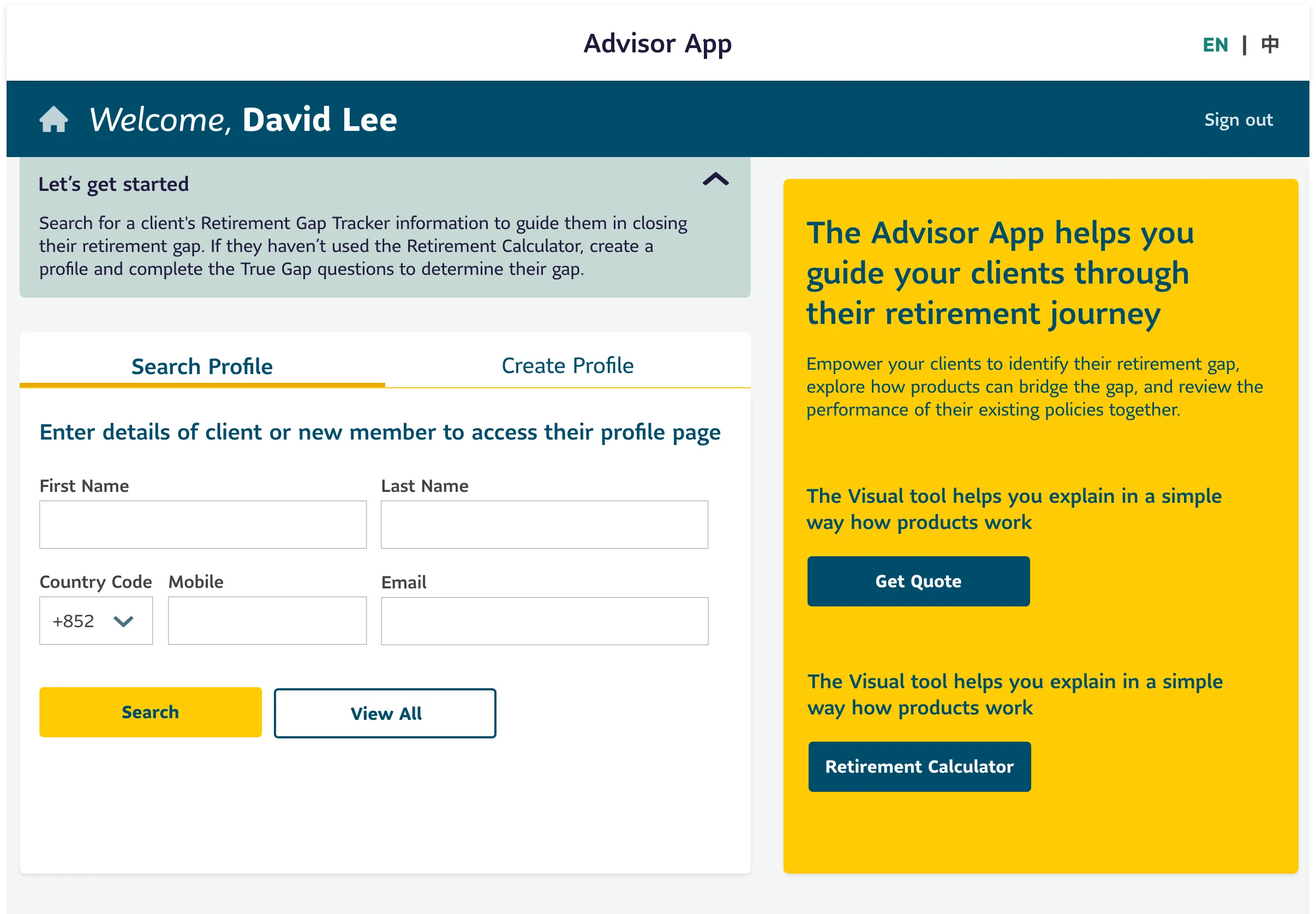
1. Profile: Quick Client Access
Before:
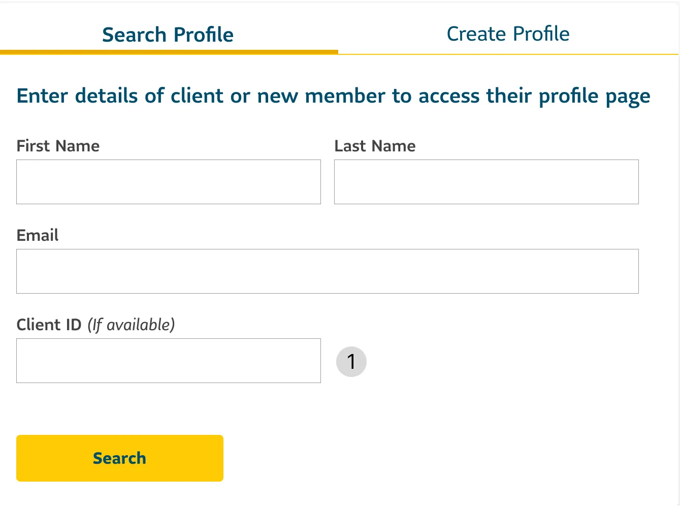
- Advisors relied on client IDs, which were difficult to distinguish.
After:
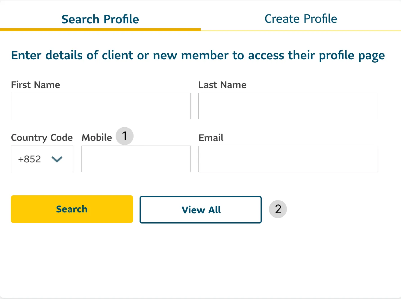
- Client ID replaced with mobile number.
- New ‘View All’ for faster access.
Before:
After:
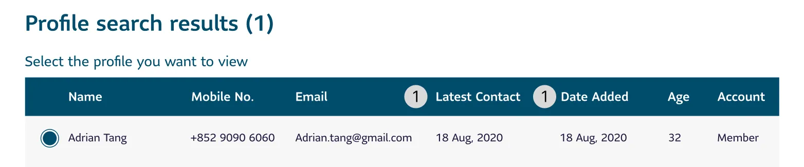
- Search results include "Last Contacted" and "Date Added" timestamps to improve clarity.
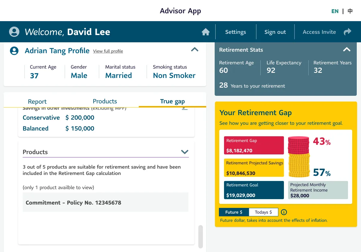
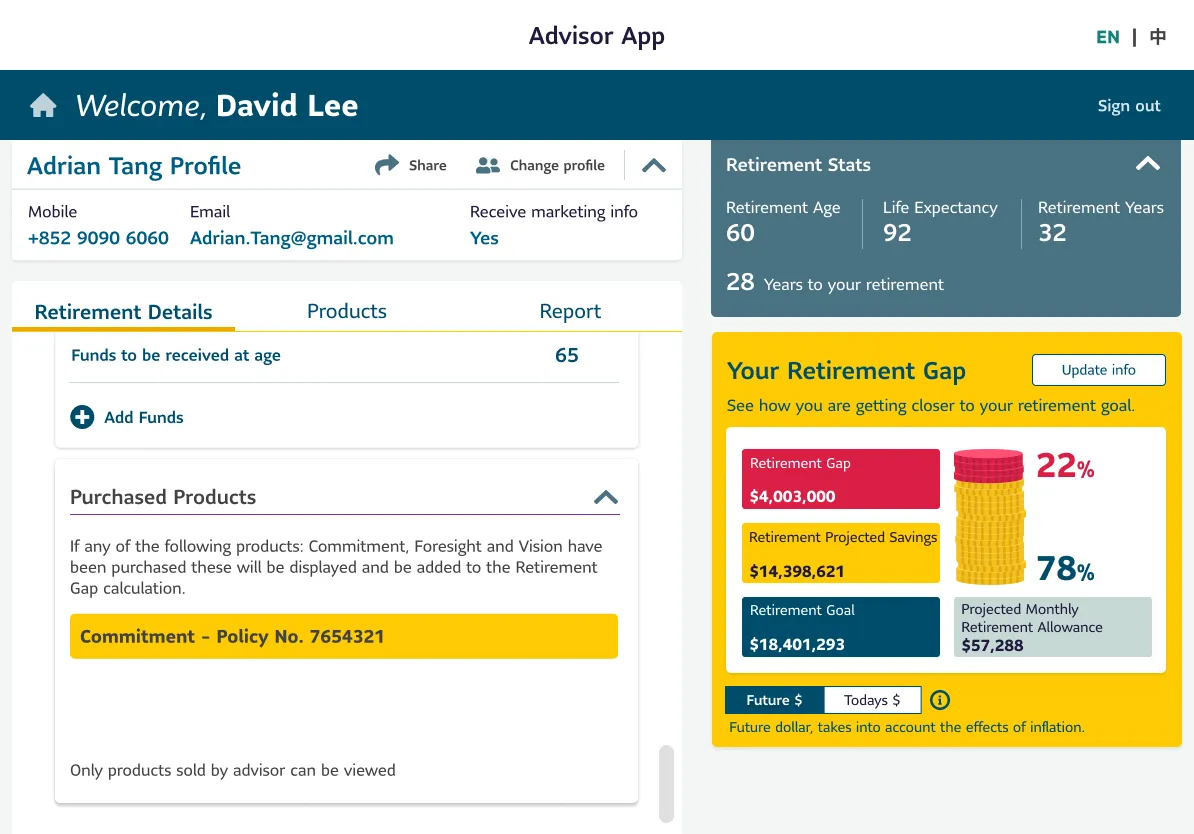
2. Financial Details: Simplifying Data Input & Access
Before:
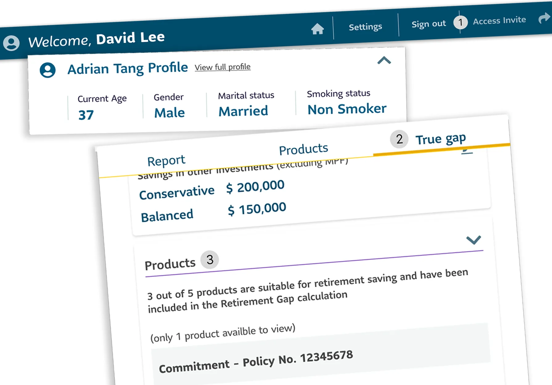
- Key actions like “Access Invite” were hard to find, slowing down workflows.
- The term “True Gap” didn’t align with advisor expectations or mental models.
- Product details lacked clarity, making it difficult to explain them to clients.
After:
- Replaced ‘Access Invite’ with ‘Share’ in grid layout. Added email and mobile details in the profile section to simplify client identification.
- Renamed and reordered to match advisor workflows.
- Clickable products for faster access to info.
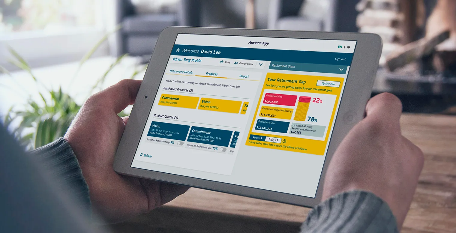
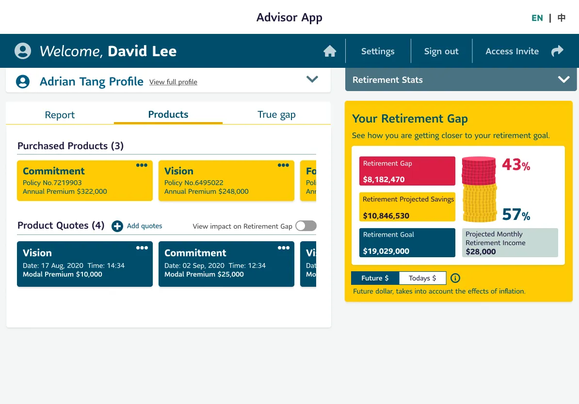
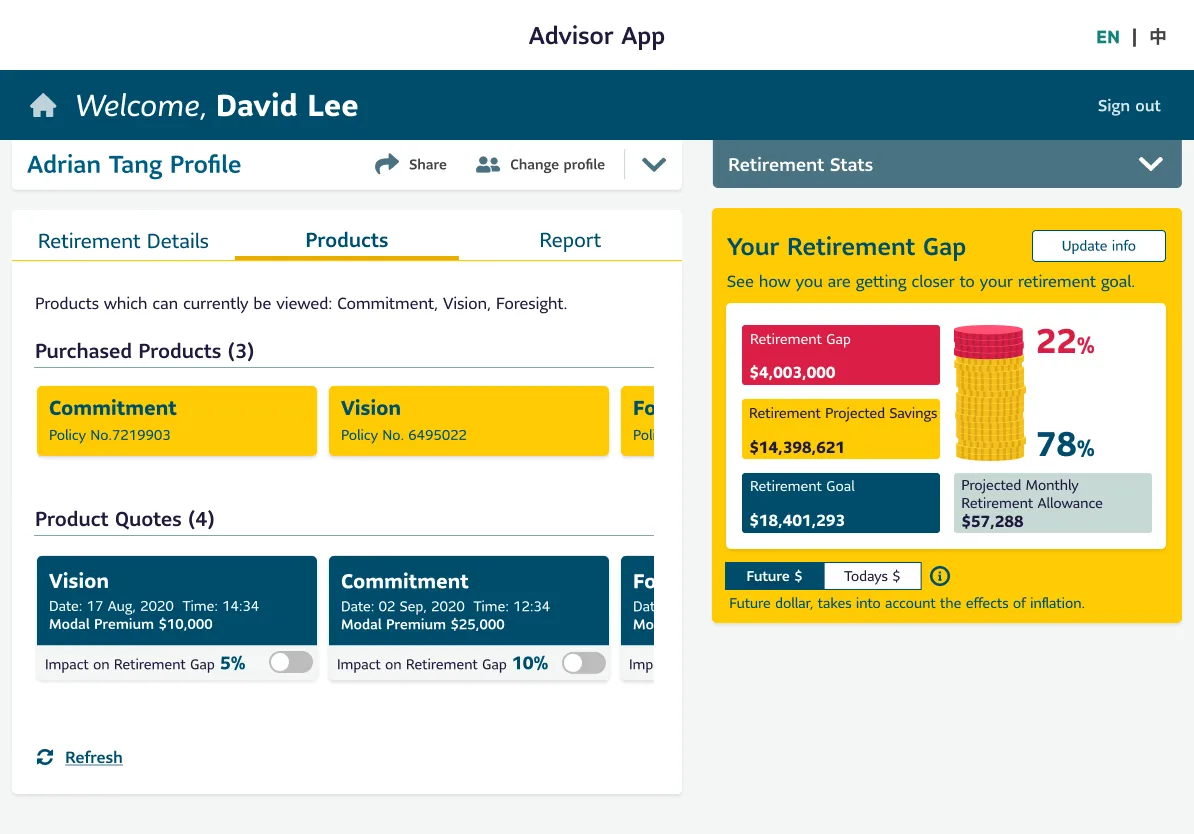
3. Product & Impact: Helping Advisors Communicate Value
Before:
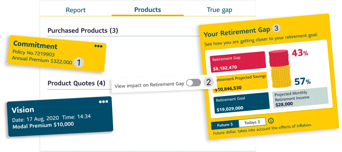
- Showing policy numbers and annual amounts duplicated report data.
- Toggles were hard to find.
- Updating financial info required multiple steps.
After:
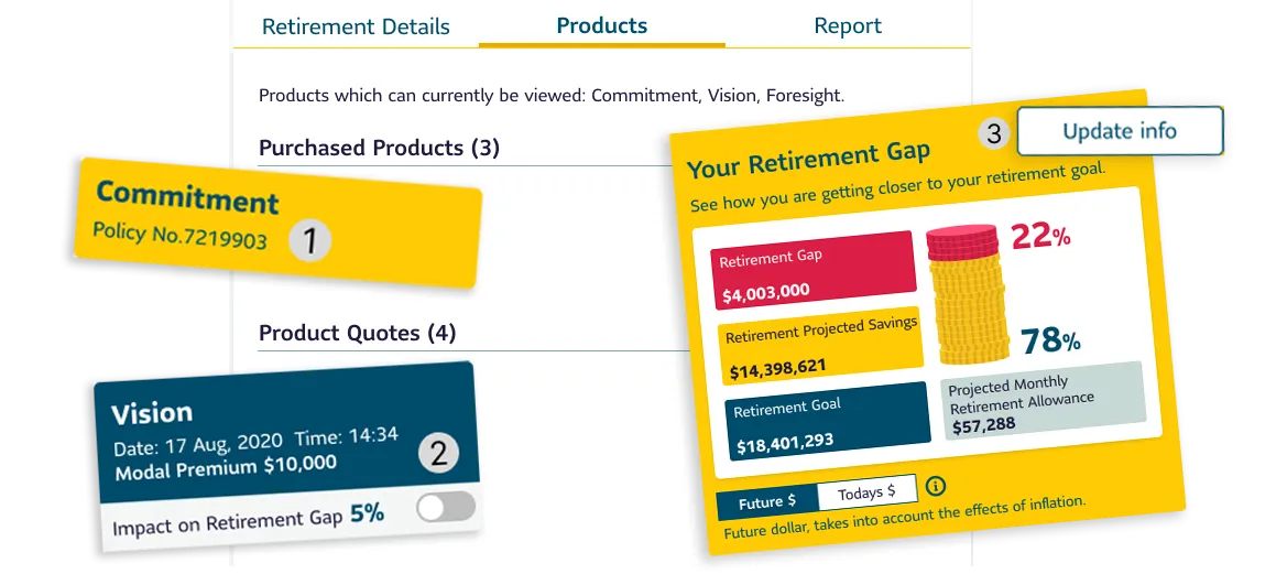
- Clutter reduced — only policy numbers shown”.
- Impact % now clearly displayed per quote.
- New ‘Update Info’ button for in-context edits.
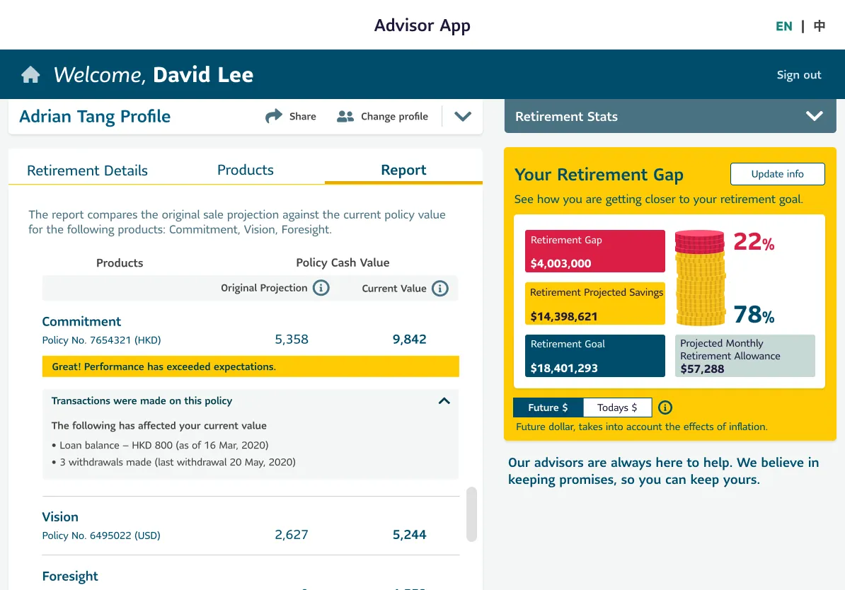
4. Report: Making Insights Actionable
Before:
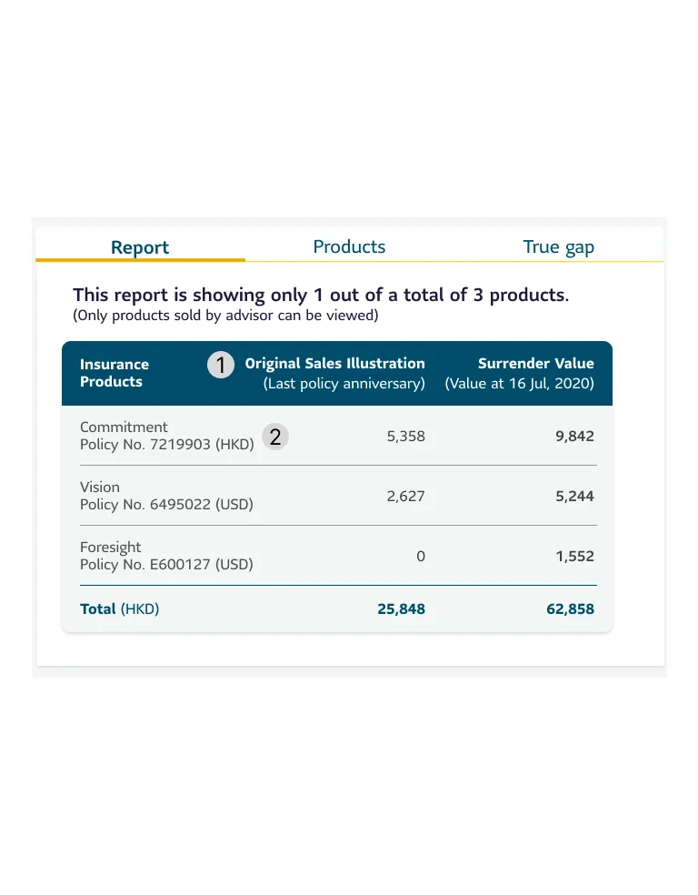
- Report descriptions were vague, making it hard for advisors to know which products were included.
- There was no transaction history, and projections lacked explanation, causing confusion.
After:
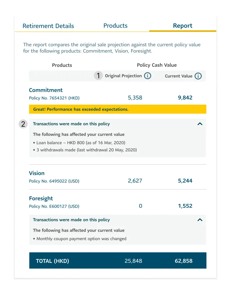
- Tooltip explains projection differences.
- Motivational messages for high-performing products” and new transaction history added.
Selected New Design
Outcome
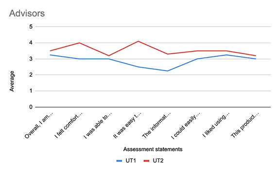
24%
Usability score increase
The average usability score jumped from 57% in the first round to 71% in the second, reflecting a 24% improvement in usability.
This demonstrates better efficiency, clearer navigation, and higher user satisfaction, highlighting the impact of our refinements on advisor workflows.
This demonstrates better efficiency, clearer navigation, and higher user satisfaction, highlighting the impact of our refinements on advisor workflows.
81%
Overall satisfaction score
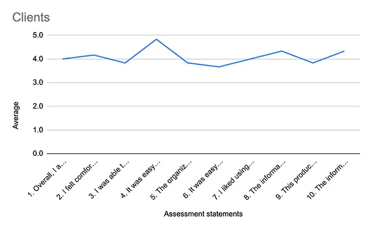
Usability testing with clients resulted in a strong overall satisfaction score of 81%, indicating a positive user experience.
Clients found the system intuitive, with high ratings for ease of use, organization, and overall comfort.
Clients found the system intuitive, with high ratings for ease of use, organization, and overall comfort.
Business Impact
Since this project was hosted on the insurance company’s servers, detailed data was not shared with our team. However,
Over
90%
Advisors actively used
Prototype
If additional data were available, key business impact metrics could include:
- Advisor Efficiency
Time saved per advisor in managing client data and making recommendations. - Client Conversions
Number of clients who purchased insurance through the app. - New Member Accounts
Growth in client sign-ups due to the app’s usability. - Client Engagement
How frequently clients update their information. - Advisor Retention
The impact of the app on keeping advisors engaged with the company.
What I Learned
1. Adapting to Remote Testing
Running sessions remotely meant thinking on my feet. Technical issues were inevitable, so I had to stay calm, troubleshoot quickly, and keep the experience smooth for participants.
2. Navigating User Frustration
Some advisors voiced frustration with the company itself, not the app. It was a powerful reminder that usability testing requires empathy and emotional intelligence, not just good questions.
3. Keeping Conversations on Track
At times, sessions drifted off-topic. I learned how to gently guide users back without making them feel rushed or unheard, striking a balance between structure and comfort.
4. From Feedback to Function
Testing surfaced real UX pain points such as confusing labels and unclear hierarchy, which we turned into actionable design improvements, making the app more intuitive and task-friendly.
