AI x UX Workflow.2026
Designing for Jane App with an AI-Native Workflow
Working the front desk of a Vancouver clinic, I kept running into the limits of our booking platform, Jane, and I wanted to fix them. The catch was that I had no Figma file, no design system, and no internal access. Just Jane's public demo site.
So I turned it into an experiment. Could an AI-assisted workflow take a feature concept from UX audit to a user-tested prototype, with no access to the product's design system? I ran it twice. First on a small feature, multilingual support, then on a harder one, ICBC case tracking (auto-injury insurance claims), to find where the method held up and where it broke.
Team
- Solo
- Tested with 5 receptionists
- Tested with 2 practitioners
- Tested with 5 receptionists
- Tested with 2 practitioners
Deliverable
- UX Audit
- Markdown Context System
- Concept Screens
- HTML Prototypes
- Usability Testing
- Markdown Context System
- Concept Screens
- HTML Prototypes
- Usability Testing
Tool
- Jane App
- Figma
- Claude Code
- Codex
- Figma
- Claude Code
- Codex
Result
3
Manual steps removed in insurance tracking
2 Weeks
Concept to tested prototype, both features
AVG SEQ 6.2/7
Across 5 testing scenarios
ICBC Prototype
Why this Problem
Working the front desk, I saw the same friction every week. ICBC cases lived in manual notes that were easy to misread during a busy shift, and older Chinese-speaking patients often couldn't complete the English intake form without a staff member sitting beside them.
This experiment asked a different question: what if the product itself closed these gaps?
AI Workflow
Without a design system to point the AI at, it kept inventing its own UI instead of matching Jane's. So before designing anything, I used MCP to study Jane's UI patterns from the demo site and built a markdown system to capture them as a working design system the AI could design within.
I built that structure into three groups of markdown files, each with a clear job:
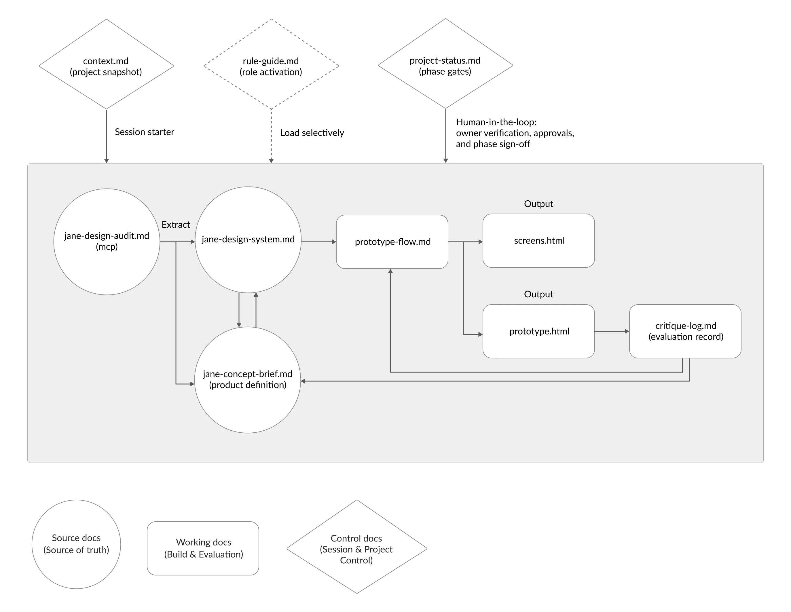
- Source
Jane's UI patterns and project context, extracted via MCP. The source of truth. - Working
The concept brief, prototype flow, generated screens, and a critique log. Where the building and evaluation happen. - Control
Session and project control: role activation, phase gates, and the points where I stepped in to verify and sign off.
Because the whole project lived in these files rather than one long chat, I could move it from Claude to Codex when I hit token limits, without rebuilding the context.
The control docs kept me in the loop. I verified the audit, approved the brief, and signed off each phase. The structure was automated, but the decisions, what to keep, what to cut, what fit the clinic, stayed mine.
Multilingual Support
Older Chinese-speaking patients often couldn't complete the English intake form on their own, and reminders only went out in English, so some used their children's contact details instead. I explored adding a language preference that carried through the patient's experience.
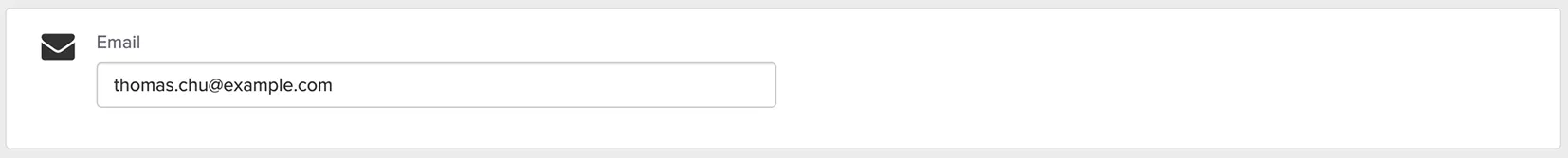
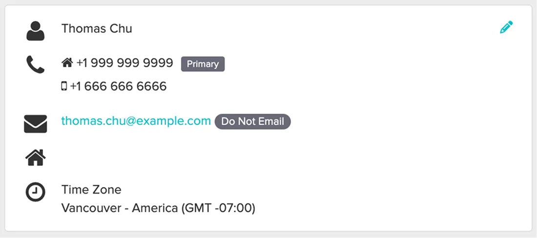
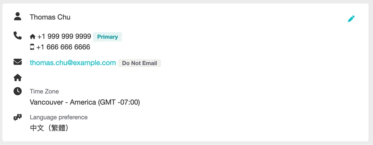
1. Adding language preference to the patient profile
Staff set it once in Edit Profile, and the saved preference shows in the Profile Preview beside existing contact details. Easy to set during setup, easy to notice during daily work.
Before:
After:
2. Applying language preference to patient intake forms
The form keeps Jane's original layout and structure, but appears in the patient's selected language, so they can complete it without a staff member translating.
Before:

After:

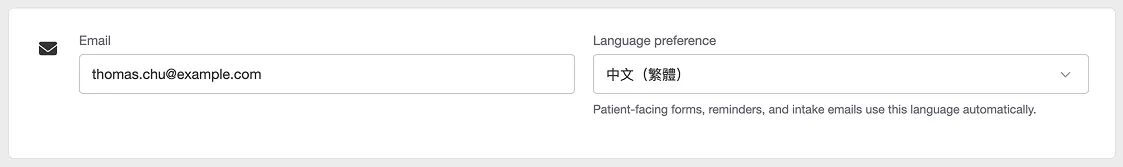
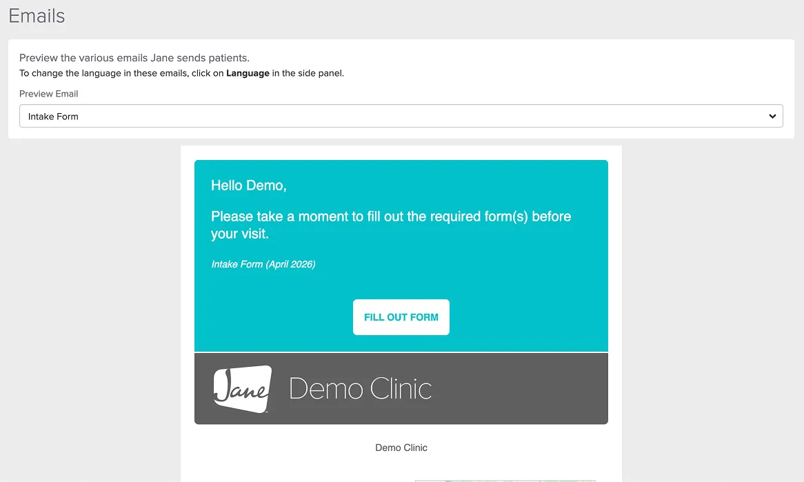
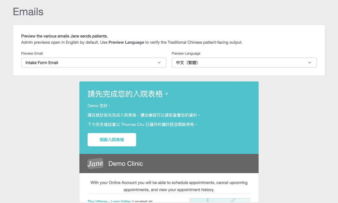
3. Previewing patient emails in the selected language
Staff can preview patient-facing emails in the chosen language before sending, so they can trust what the patient will actually receive.
Before:
After:
Tested with five receptionists
I ran think-aloud sessions with four receptionists, rating each task for ease on a 7-point scale. The three tasks were:
- Setting a patient's language preference
- Previewing the intake form in another language
- Previewing the email and SMS reminders
What the sessions showed:
- Worked well: language preference and intake form preview were fast and rated easy by all four.
- Needs iteration: the reminder preview scored lowest and took nearly twice as long.
- Validated: all four described it as native to Jane and agreed it addressed the problem.
From UX audit to a working prototype took 3.5 days, with no Jane design files and no Figma, just markdown, MCP, and HTML.
Prototype:
I documented this workflow in full, including the file structure and what broke along the way, in a two-part series.
→ Part I: Building the markdown workflow
ICBC Case Tracking
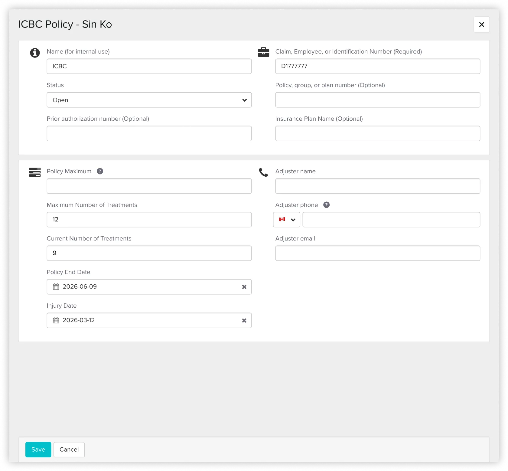
Unlike regular appointments, ICBC treatments required staff to track approvals, session limits, extension periods, and claim details over time.
I designed ICBC as one connected case record and followed a single policy through its lifecycle. The same key screens carry the case from setup to extension:
- Setting up the case
Entering the initial ICBC policy and session count at booking. - Reading it mid-plan
Claimed, unsubmitted, remaining, and expiry surfaced in the appointment view, so staff read status at a glance. - The treatment-plan reminder
When the case nears its session limit, the assigned staff gets a reminder to prepare the extension. - Adding the extension
More sessions added as a new approval period on the same record, so the original history stays intact.
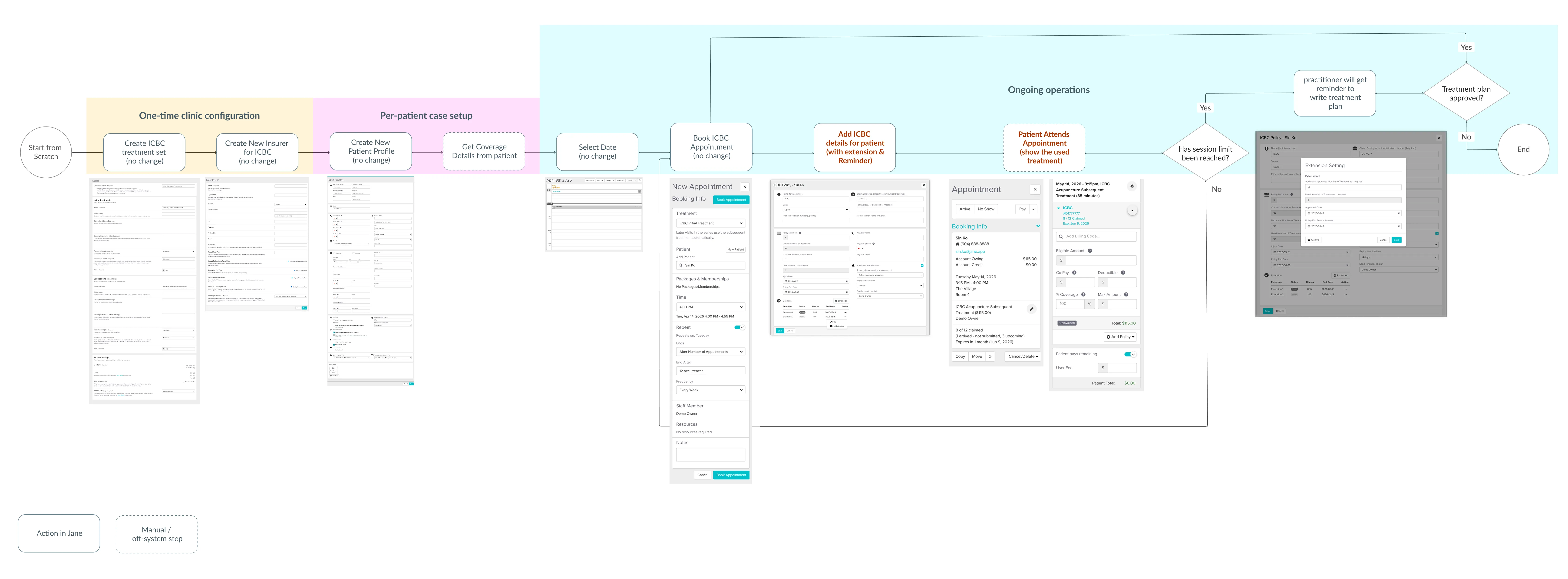
1. One connected ICBC case, from setup to extension
The same record handles setup, the treatment-plan reminder, and the extension, so the full case history stays in one place instead of scattered across separate tasks and manual notes.
Before:
After:
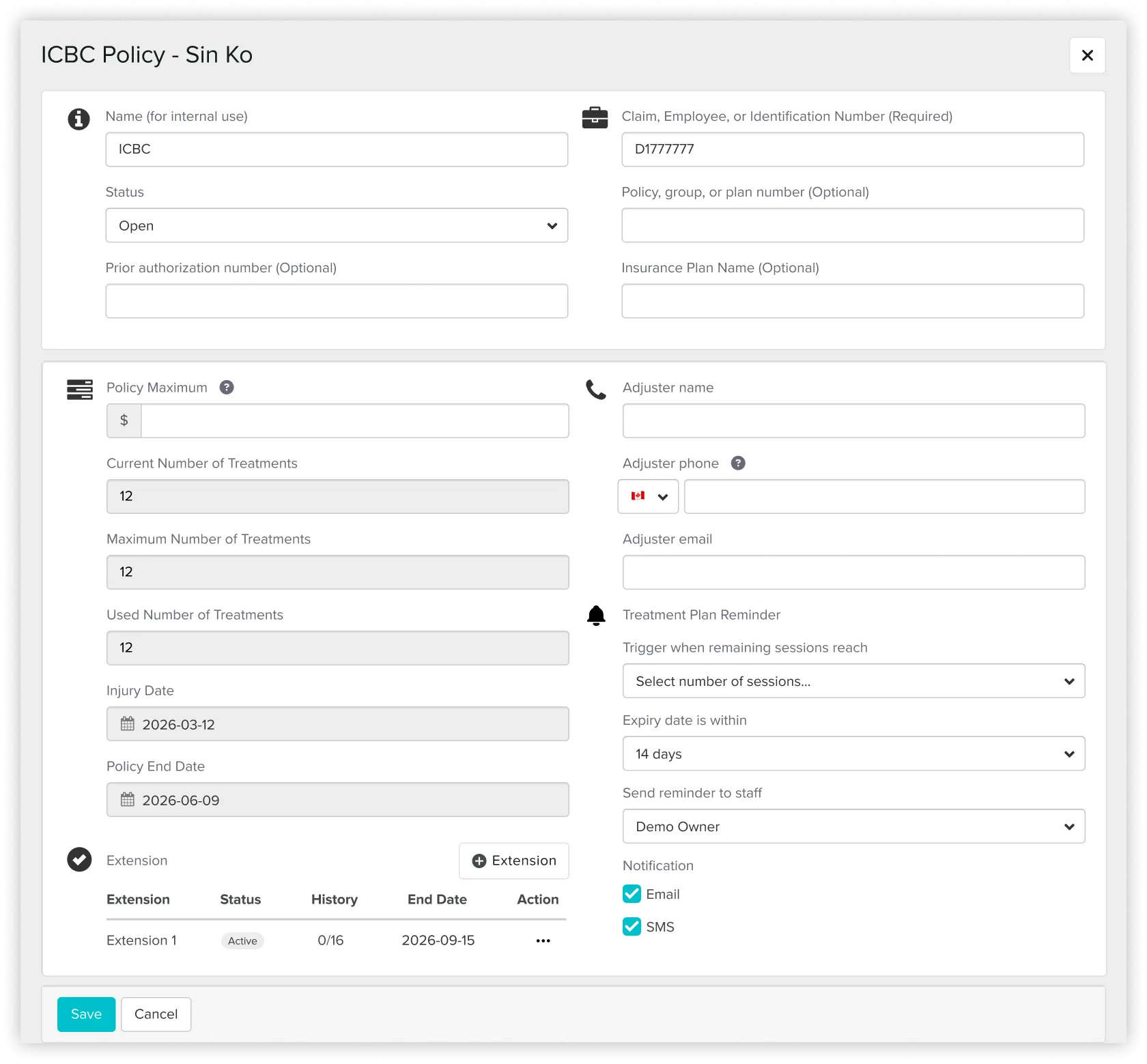
An automatic reminder for treatment plan preparation, replacing the manual follow-up previously handled by reception.
2. Surfacing session usage and expiry details directly in appointment views
ICBC usage was tracked manually in notes, which made case status easy to miss during busy shifts or across multiple receptionists.
Before:
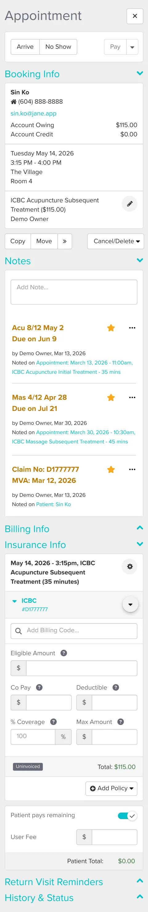
After:

I surfaced claimed sessions, unsubmitted visits, and the expiry date directly in the appointment view, so staff could read a case at a glance instead of recounting from notes.
Where the method strained
The case ran across a long flow, from one-time clinic setup through ongoing operations, and touched the schedule, appointment sidebar, policy record, and billing.
Prototype:
- One file couldn't hold four scenarios.
Every time I refined an earlier scenario, the later ones fell out of sync and stopped matching. I split the prototype into three files so each scenario stayed stable on its own. - The full journey needed to be seen end to end.
Only the ICBC screens were new; the rest reused Jane's existing screens. I designed the new ones in HTML, captured the unchanged steps from the demo, and assembled the full journey in Figma.
The markdown system kept governing context, rules, and critique throughout. The split files and the Figma assembly were about keeping a growing prototype stable and testable, not replacing the workflow.
Usability testing
I ran moderated think-aloud sessions on the HTML prototype with four clinic staff (two practitioners, five receptionists), rating each of four tasks for ease on a 7-point scale. Two tasks validated cleanly; two surfaced clear, repeated problems.
What held up:
- Setting up a new case and reading a mid-plan one
All four completed both unaided, reading claimed, unsubmitted, and remaining sessions at a glance.
What needs another pass:
- The reminder was hard to find
75% struggled to reach it through the task menu. It should surface where staff already work, on the patient sidebar or appointment card. - The extension read as "edit," not "add"
75% tried to change the original session number instead of adding a new approval period.
The fix they pointed to: lock the original fields once the limit is reached, so the extension becomes the only visible path. - Some labels slowed people down
"remaining sessions" was read two different ways, flagging it for a copy pass.
These define the next iteration rather than changes already made. No task failed, but the two friction patterns are clear enough to redesign before the concept would be ready for real use.
→ Part II: Scaling the workflow to a harder feature
The reusable system
The markdown workflow behind both experiments is open-sourced as a template: the role structure, phase gates, the design-system extraction method, and the usability-session format, generalized so anyone can use it.
→ View the template on GitHub
Key Learnings
Designing from inside operations
Being a real user, not just a designer, showed me the gap between what Jane supported and what the clinic actually needed.
Being a real user, not just a designer, showed me the gap between what Jane supported and what the clinic actually needed.
Scope deliberately, and know the method's edge
Starting with a small feature before a complex one let me see where an AI-direct workflow holds up and where it needs a stable tool like Figma underneath it.
Starting with a small feature before a complex one let me see where an AI-direct workflow holds up and where it needs a stable tool like Figma underneath it.
Using AI as a structured design partner
I used a markdown based workflow to manage context, audit UI patterns, document decisions, and critique the prototype across phases.
I used a markdown based workflow to manage context, audit UI patterns, document decisions, and critique the prototype across phases.
Keeping human judgment in control
AI moved me faster, but the work still depended on knowing what to verify, what to reject, and when to make the final call from real clinic experience.
AI moved me faster, but the work still depended on knowing what to verify, what to reject, and when to make the final call from real clinic experience.
Limitations
These are concepts, not shipped features. They validate design directions with a small group of clinic staff, not production outcomes, and weren't tested by Jane.
