Rule Builder.2025
Rule Builder for Non-Technical Users
I led the 0→1 UX for a B2B payment recovery product, turning complex backend logic into a no-code rule builder business teams could use without a developer. The result made rule creation faster and more confident for first-time users.
Disclaimer:
This project was completed under a non-disclosure agreement. I've kept the client's confidential data and proprietary details out of this case study, and the views here are my own.
Team
- Director of Marketing
- Principal Architect
- Co-founder
- Principal Architect
- Co-founder
DURATION
14 weeks
Deliverable
- UX Strategy
- Affinity Map
- Workflow
- Persona
- Information Architecture
- User Flows
- Prototype
- Usability Testing
- Affinity Map
- Workflow
- Persona
- Information Architecture
- User Flows
- Prototype
- Usability Testing
Tool
- Figma
- ChatGPT
- Perplexity
- Gemini
- Claude
- ChatGPT
- Perplexity
- Gemini
- Claude
Impact
~50% faster
Rule creation time
Higher confidence
Clear status & confirmation steps
Built UX foundation
Built a discovery-to-test workflow in a low-maturity org

The Challenge
The team was launching a B2B web product and wanted business teams to manage complex payment recovery rules on their own.
The original framing was broad: make payment churn recovery more proactive and easier to manage.
Through discovery, I helped refine the challenge into a more specific product problem:
How might we help revenue teams edit payment-churn rules confidently without engineering support?
Building a UX Foundation
This team was new to working with UX, so I created a UX foundation deck to align on the strategy, goals, and deliverables. It established a shared language early and served as a reference point for key artifacts and decisions throughout the project.
Understanding the Problem
I ran stakeholder interviews to understand why this mattered, who'd use it, and what would constrain delivery, then clustered the input into themes with an affinity map.
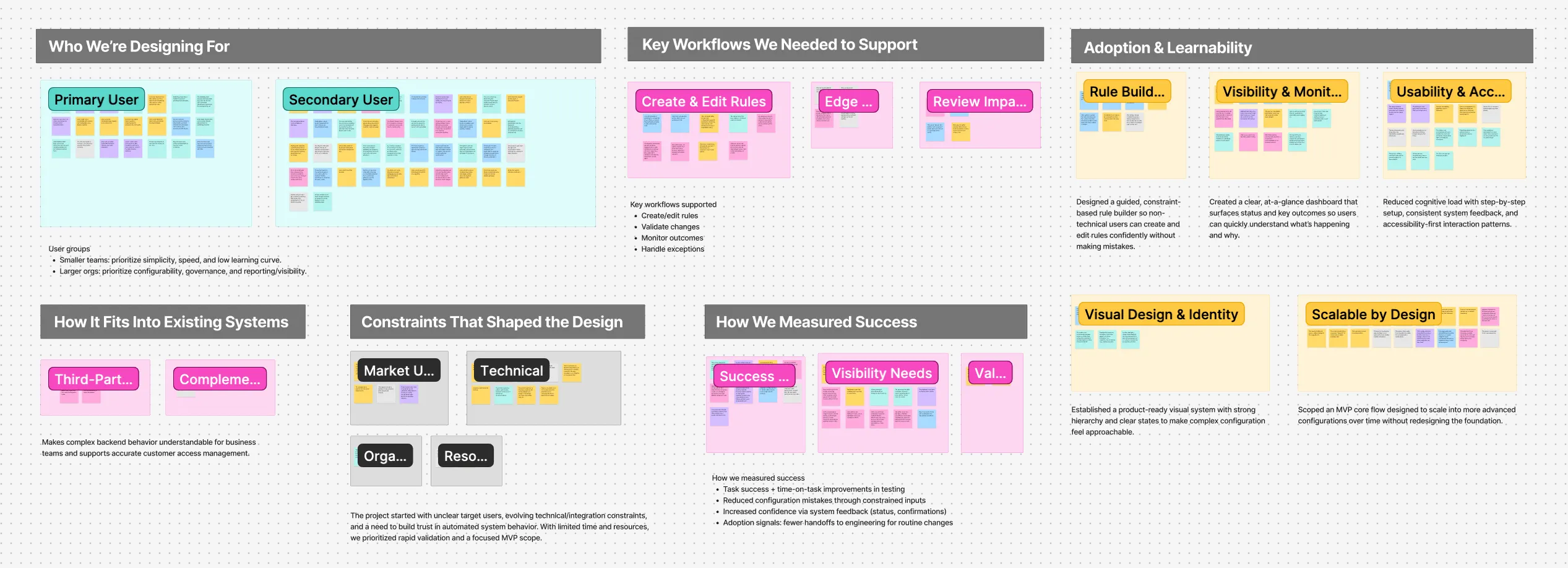
Interview Synthesis:
- The team explored turning backend expertise into a product offering that helps business teams manage recurring customer pain points.
- Target users span SMB and enterprise teams who currently rely on existing tools to cover parts of the workflow.
- Success meant proving value and viability fast, while aligning a team new to UX.
Workflow Transformation
Next, I mapped the current workflow and the desired future workflow.
1. Original Workflow
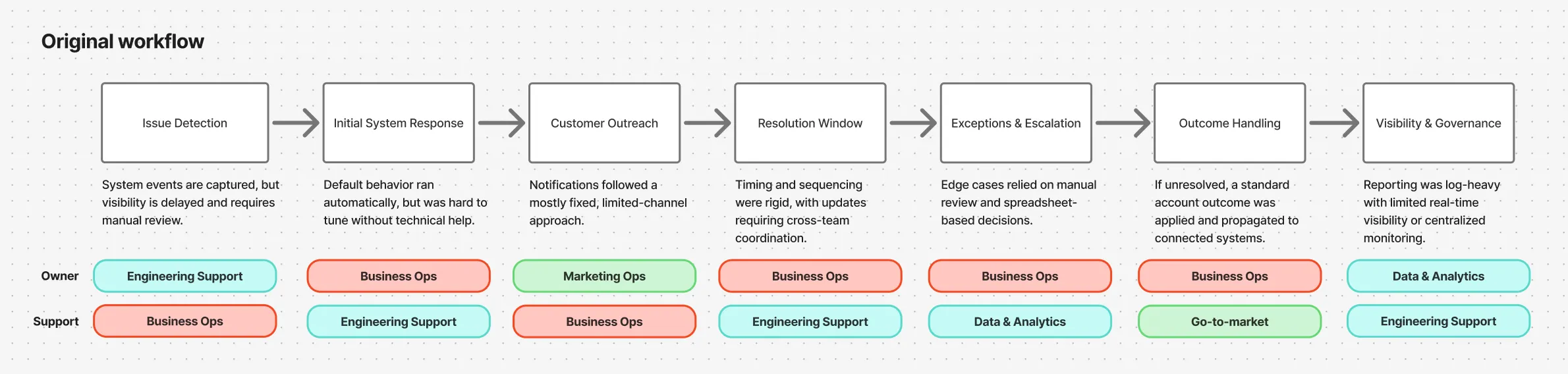
A mostly linear flow with a default response, limited personalization, and manual exception handling later in the process.
2. Future Workflow
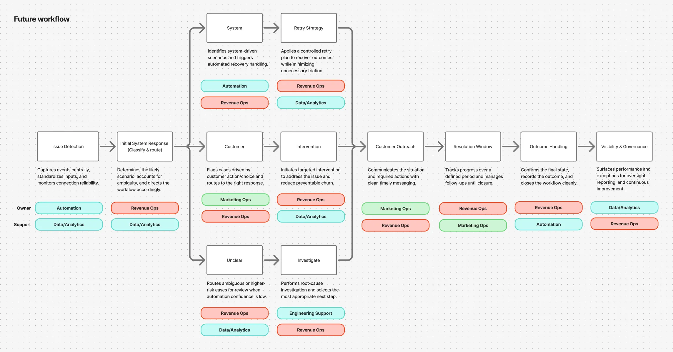
A “classify & route” step was introduced to handle cases by scenario instead of pushing everything through one default flow.
Business teams could make routine changes through the UI, and engineering could concentrate on integrations and reliability.
Who I Designed For
This work also clarified who the first release should support. Since outreach is executed through a CRM, I prioritized Revenue Ops as the primary user and focused the first phase on their core tasks.
Benchmarking the Space
I reviewed publicly available tools via marketplace apps (Shopify ecosystem), Mobbin, and AI-assisted scanning to identify relevant competitors. I captured recurring patterns and standout approaches to inform our IA and core user flows.
01
Rule builders show results for each rule and each step to help teams tune.
02
Dashboards show both rates and impact, then break results down by scenario and reason so teams know what to fix next.
03
Templates give a reliable starting point and speed rule setup.
From Workflow to Product Structure
Once the future workflow was aligned, I translated it into product structure.
I created the information architecture based on core workflows and roles, then validated it against competitor patterns and technical constraints with engineering.
That process helped define the first release around two priority areas:
- Rulesets
- Rule Building
This turned a broad product idea into a more buildable and focused experience.
Exploring the Rule Builder
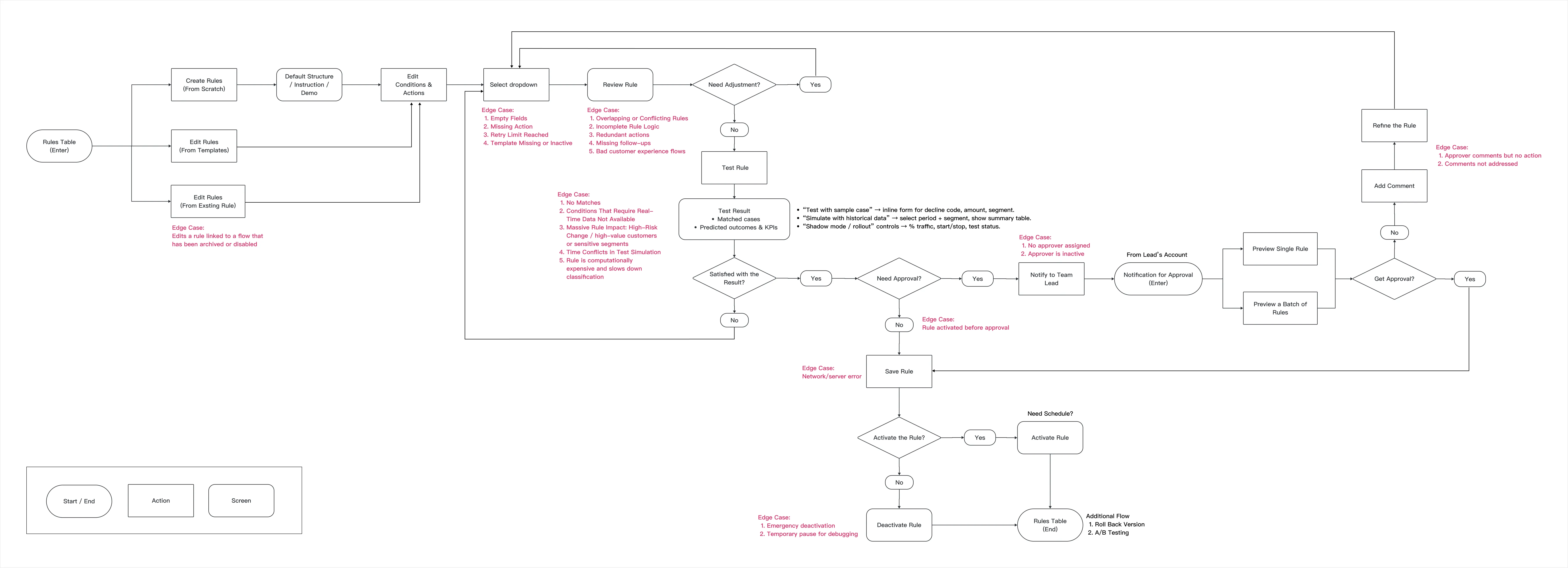
The core design challenge was how to let non-technical users create and edit complex rules without introducing ambiguity.
I explored two directions before landing on a third.
Node based flow builder
Powerful, but too complex for business teams to edit on their own.
Powerful, but too complex for business teams to edit on their own.

Free text to rule
Familiar and appealing, but risky. It would require guided input, strong validation, and extra engineering effort to keep rule translation consistent and safe.
Familiar and appealing, but risky. It would require guided input, strong validation, and extra engineering effort to keep rule translation consistent and safe.
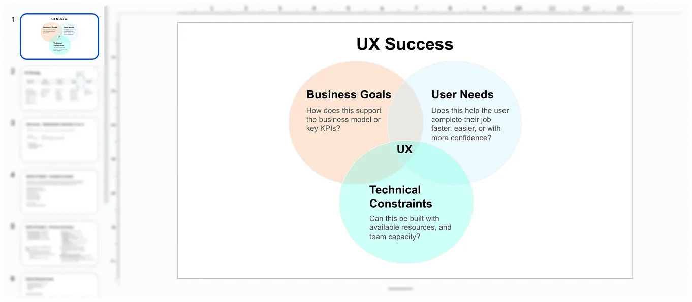
To balance usability, correctness, and delivery constraints, I designed a block and dropdown based builder. This made available options explicit, reduced ambiguity, and guided users toward valid configurations.
This was the key design decision of the project: prioritize clarity and reliability over maximum flexibility.
Clarifying Steps & Edge Cases
Structured blocks kept rule creation deterministic and easy to validate, while free text added ambiguity, so I documented the block-based experience in a user flow, including key edge cases.
Prototyping and Testing
After building a high-fidelity prototype in Figma, I ran moderated usability testing with five participants to see whether business users could create and edit rules confidently. Each person completed the same task on both the original design and the redesign, so I could compare the two directly.
In the first round, participants could finish the task, but they spent too long working out how to build a valid rule. Even when they said it felt easy, I watched the same pattern across the group: hesitation, backtracking, and uncertainty about whether they might publish something incorrect.
What I Changed
Based on testing, I redesigned the experience into a more guided, step by step builder.
I introduced:
- Clearer progression through the flow
- More explicit status and structure
- Confirmation moments to reduce fear of mistakes
- Stronger guidance around what users could safely do next
Instead of asking users to assemble logic more freely, the final concept scaffolded the experience so the product felt safer and easier to trust.
In follow-up testing with the same five participants, the guided builder cut rule-creation time by about half. They also reported feeling more confident, mainly because the clearer structure and confirmation steps reduced the fear of publishing something wrong.
Trust but Verify
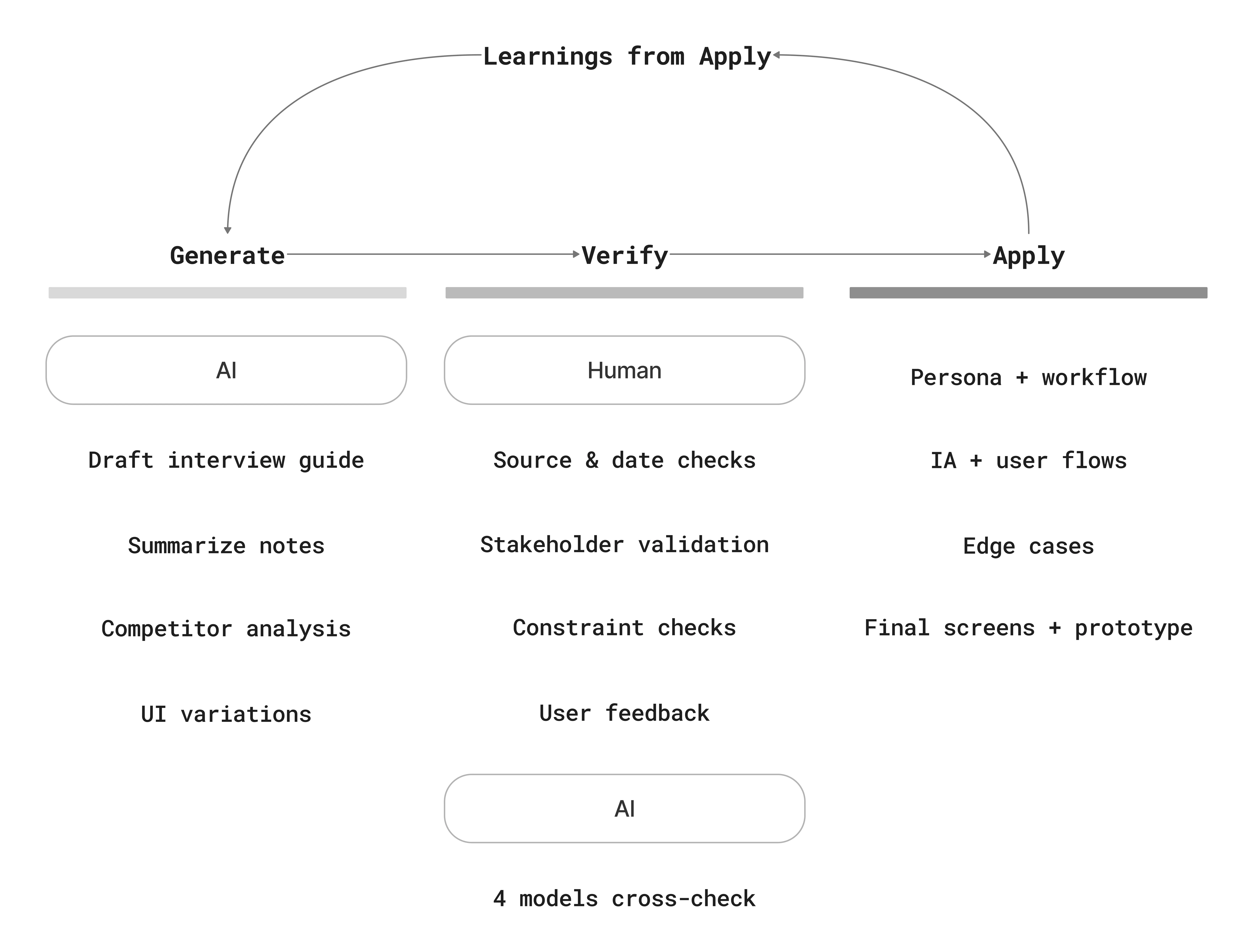
This was my first 0→1 project using AI deeply, so I treated it like a research teammate rather than a decision-maker. I used AI to accelerate synthesis, market scanning, and ideation, then validated outputs through source checks, stakeholder review, feasibility constraints, and user feedback.
To reduce errors and bias, I cross-checked results across multiple AI systems and primary sources, and I used AI to critique my interview scripts and facilitation between testing rounds.
Impact
Faster rule creation
Follow up testing showed about a 50% improvement in time to create a rule.
Follow up testing showed about a 50% improvement in time to create a rule.
Higher confidence for first time users
Users felt safer moving through the flow because progress, status, and confirmations were more explicit.
Users felt safer moving through the flow because progress, status, and confirmations were more explicit.
Stronger product foundation
The project translated a messy backend process into a clear structure for future product development and cross functional alignment.
The project translated a messy backend process into a clear structure for future product development and cross functional alignment.
Reflection & What's Next
This project reinforced how much confidence matters in workflow-heavy products. Getting users through the steps is one thing; getting them to trust what they're about to do is the harder part.
It also showed me how much impact design can have in 0→1 environments, where the work extends past the interface into workflow, scope, and the shared understanding behind a product.
Next, I’d define a lightweight measurement plan (adoption, rule error rate, time-to-change) and continue strengthening governance UX (approvals, versioning, rollback) to support sustainable business ownership.
