Spark Assistant.2021-2022
Leading Design System Consistency
I led the refinement of Spark Assistant’s design components, implementing auto layout for adaptability and ensuring brand consistency across the platform. Additionally, I designed key features of Spark Assistant on Excel to create a cohesive and intuitive user experience.
-
-
-
-
-
-
Product
B2B
SaaS
Excel Add-in
Team
Product Manager
Head of Design & Experience
Senior Product Designer
Product Designer (me)
Developer based in India
Deliverables
Design Component
Workshop
Presentation
User Interviews
UI Designs
What is Spark Assistant (SA)?
SA is an Excel add-in that connects Excel to the Coherent Spark platform, enabling the seamless transformation of Excel logic into APIs. It allows users to upload, configure, and test spreadsheets directly in Excel, with features like version comparison and rate table creation.
What is Our Goal?
SA has become the hero product, other products like Explainer, Flow, and Connect are set to integrate with it. The goal is to align SA with the company’s broader design system to ensure consistency across all products. Additionally, the aim is to unify branding, layout, and user experience with Spark’s design language.
Challenges
  • How might we standardize components across products for consistency?
  • How might we fix internal inconsistencies within SA?
  • How might we collaborate effectively to refine the design system?
Strategy
The SA components were refined by leveraging Ant Design as the foundation, customized to align with Spark’s unique branding elements like colors, typography, and UI styles. Following an accessibility audit, adjustments were made to ensure compliance with WCAG standards and enhance usability for diverse users.
The final SA components combined the strengths of Ant Design, Spark branding, and accessibility improvements to create a unified, scalable, and inclusive design system.
Naming Convention
Since we aimed to implement auto layout in our design system, establishing a clear naming convention was crucial for creating Figma variants.

I researched from Google and Medium to build a foundational understanding of the structure and best practices.
Consolidation
I consolidated the naming conventions from all products' designs, analyzed the differences, and identified ways to align their structure for consistency across the design system.
Alignment
After studying the materials, I conducted a workshop to present my findings and address naming inconsistencies.

The workshop ensured all designers were aligned on the naming structure, understood the design system process, and were on the same page moving forward.
Prioritization
After finalizing the foundational structure of the variants, I identified and analyzed the components used across each page.

The most frequently utilized elements were prioritized for refinement to enhance consistency and overall efficiency within the design system.
Audit
1
Unfold
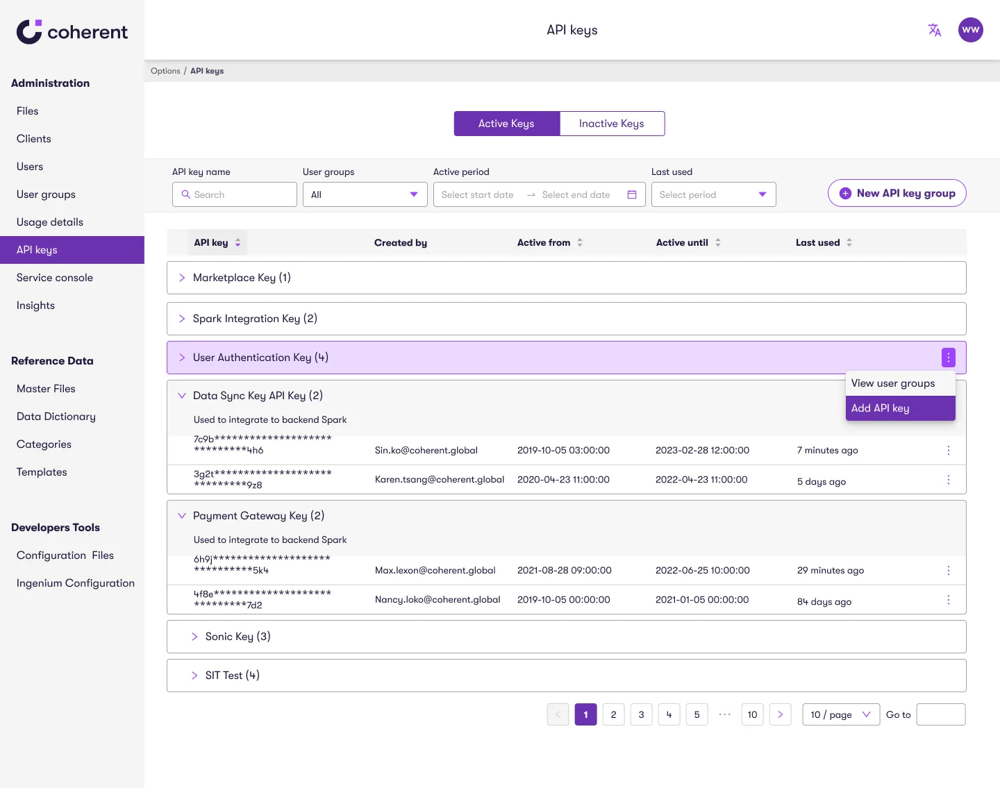
After completing my research, I decided to develop two design directions. To explore these directions, I drew two different user flows. These charts detail the new interactions, navigation paths, and labeling for each design, making it easier to visualize the user experience.
Single-Page Design
Original User Flow
Two-Layer Design
New user flow
They also serve as a basis for discussions with the senior product designer and product manager, helping align on the best approach forward.
A/B Testing
To determine the optimal design for user efficiency and satisfaction, I conducted A/B testing with internal users.
A. Single Page Design
  • Pro - Quick access to all keys.
  • Con - an become cluttered, especially with a large dataset.
B. Two-Layer Design Page
  • Pro - Organized and scalable.
  • Con - Extra navigation needed.
Based on the A/B testing results, I chose to proceed with the two-layer design page. This design provides the best balance between usability and scalability, meeting user needs effectively while allowing room for future growth.
Details
Tooltips
  1. Indicate invalid or expired keys.
  2. Shows last accessed date/time for API groups.
  3. Displays deactivation details, including who deactivated the key and when.
Date Format
  1. Revised to show relative time for better readability.
Status
  1. Sort keys by active, future-active, expired, or deactivated.
Usage
  1. View keys based on recent activity within a chosen timeframe.
Create New Key
  1. Shifted "Create API Key" to a modal, with a prompt to copy the key before closing.
Editing Active Period
  1. Adjust API key active period directly in a modal.
Deactivation and Reactivation
  1. Streamlined deactivation and reactivation using modals for consistency.
I designed the second page to auto-filter and sort, showing priority keys at the top for a quicker, more efficient user experience.

Filtering by Active Keys
  1. Display only active keys, ensuring they see the most critical information first.
Sorting by Active Period (Ascending)
  1. View keys with the shortest remaining time appear at the top.
Outcomes
Usability Improvements
After implementing these updates, a second round of usability testing showed:
15.6%+
Ease of use rating increase
30.62%
Reducing time to complete the tasks
These results confirmed the design’s positive impact on user satisfaction and efficiency.
Comparison of usability test 1 & test 2
Press release of business impact
Business Impact?
Although no specific metrics were set for this page, our user-centered design approach contributed to broader business successes, including:
USD $75M
Series B funding
20+ Partnerships
Including Snowflake, AWS and Microsoft
These milestones highlight the value of a strategic, accessible design in driving product success.

After securing Series B funding from the U.S., we recognized the need to meet critical legal and accessibility requirements, specifically the Americans with Disabilities Act (ADA) and the Web Content Accessibility Guidelines (WCAG).

I was tasked with conducting an accessibility audit to ensure our website meets these standards, making it accessible and inclusive for all users.
Accessibility
Approach
Initially, the accessibility project scope felt broad, with no clear starting point. After researching, I found the W3C Web Accessibility Easy Check guide which provided a structured approach to assessing our site’s compliance with accessibility standards.

Steps Taken:
  1. Systematic Assessment
  2. Ticket Creation
  3. Prioritization
Slide of Accessibility Research
Knowledge Sharing
Following my research, I created a presentation for the design team to emphasize the importance of accessibility in our work.

This knowledge-sharing session aimed to align every designer on our team with accessibility principles, ensuring that these considerations become a natural part of our design process.
Findings
During the accessibility audit, I discovered that some components in our Ant Design System lacked built-in accessibility features.

To address this, I reviewed all design components we were using, capturing screenshots and documenting each component with accessibility gaps.

I then collaborated closely with the development team, providing guidance on the necessary manual adjustments to meet accessibility standards.
Research, Findings, and Execution
Cross-Functional Collaboration
I shared these findings and the limitations of our Ant Design System with the CTO, managers, developers, and actuaries.

This presentation led to the adoption of accessibility guidelines across both design and development teams, promoting a unified, inclusive approach in our product development.
Sin was instrumental in our Accessibility initiative. With our SaaS hero product targeting the US market, accessibility was a priority. Sin proactively created and addressed multiple JIRA tickets, ensuring our platform aligned with US accessibility standards.
Maxence Le Corre, Product Design Lead, Coherent
Left arrow for the previous case study
Smart Home App
Enhancing User Engagement through UI Revamp